Helping refugees resettle to the United States
Introduction
Project overview
Despite the urgency of the matter, the refugee resettlement process often consists of months and months of waiting, hours of preparation, bottomless stacks of forms and materials, and countless interviews and appointments.
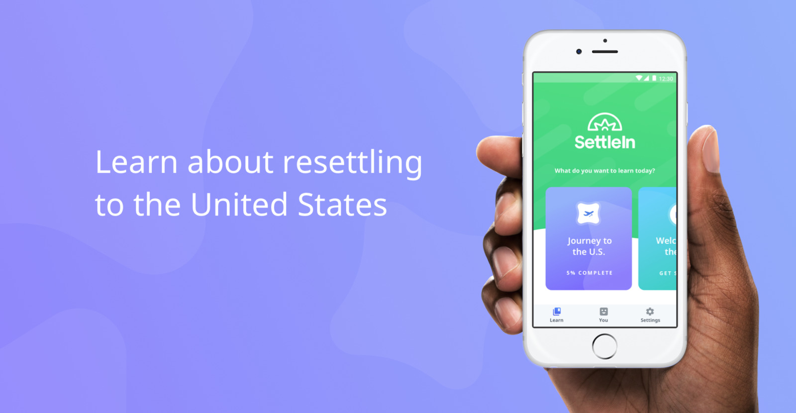
The International Rescue Committee (IRC) came to ISL looking for a digital solution that would bridge the gap between pre-departure and post-arrival refugee resettlement experiences, and increase comprehension around core cultural transition information. The result was SettleIn.
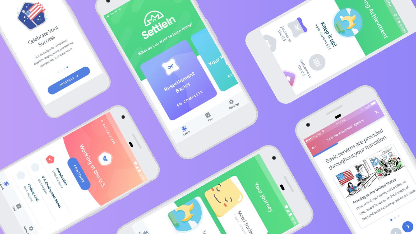
The chapter selection screen.
The problem
A key tenet of IRC’s cultural orientation (CO) program for refugees is self-sufficiency — but given the stress, complexities, and information overload that go along with the resettlement process, that vital information can be difficult to process and retain over time.
The refugee resettlement program lacks a digital orientation resource that would help refugee families acclimate to their new environment and access relevant CO materials any time on their preferred mobile device in order to accelerate their path to self-reliance.
The goal
Effectively communicate and increase refugee comprehension around critical pre- and post-arrival resettlement information. My role during the project was to support the Sr. UX Strategist and interactive design team through all phases of discovery, research, design, and testing heading into future sprints.
. . .
Research
Kick-off
In order to thoughtfully approach the challenge at hand, we embarked on a comprehensive discovery phase that included interviewing and surveying stakeholders around the globe, comparative analyses, familiarizing ourselves with cultural orientation curriculum, and lots of research.
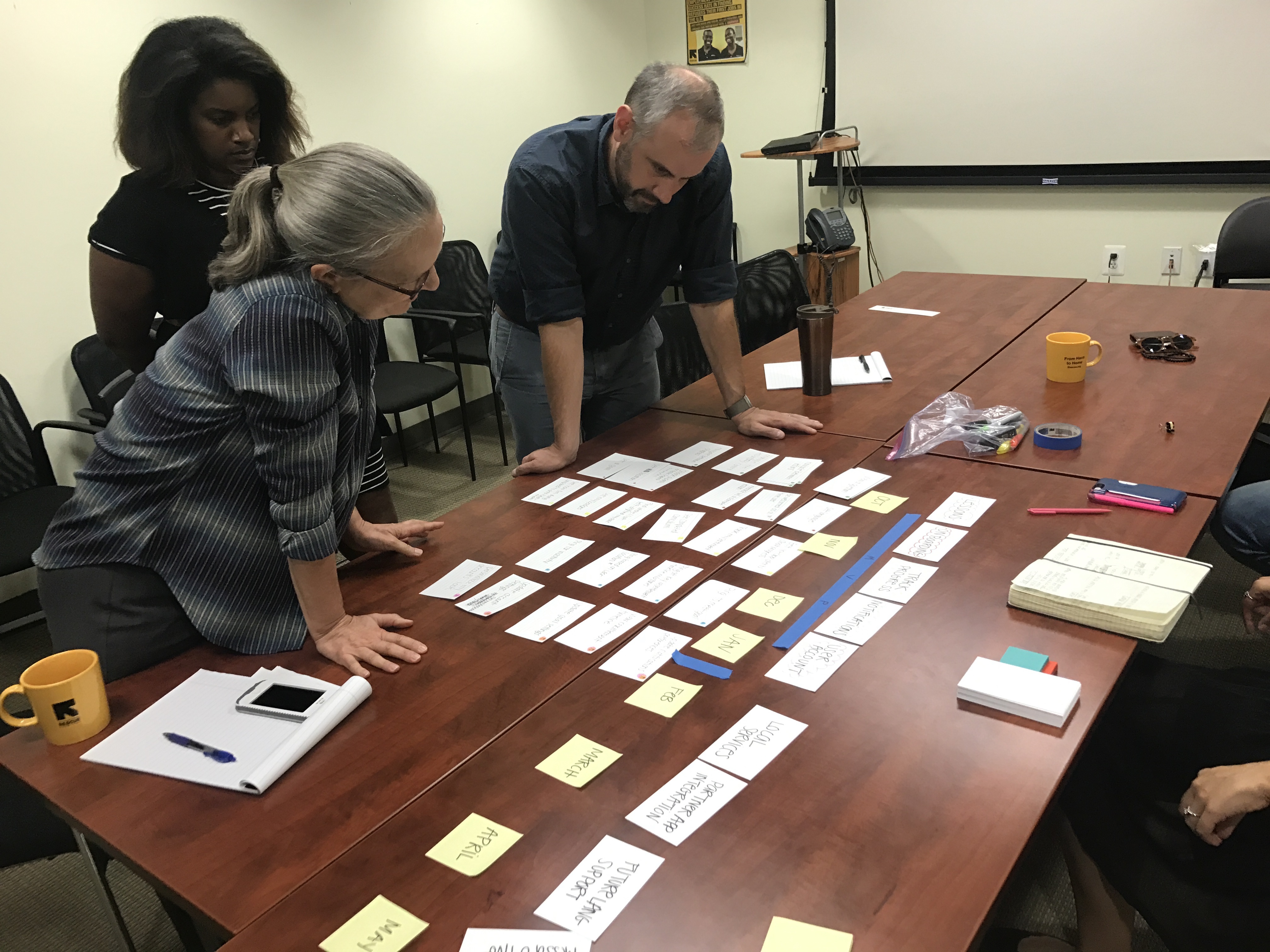
A short brainstorming exercise that helped both teams prioritize orientation content and determine milestones for the project.
Interviews & surveys
We began with stakeholder interviews and CO surveys to define our research objectives and build consensus about what problems we’re focused on solving. This was the time for us to evaluate any assumptions around the project goals and for the team to gain insight into the efficacy and impact of the cultural orientation process and how it contributes to refugee’s ability to acclimate in their new environment.
This was a tag-team effort from both the ISL and IRC team so we needed to create a script that could be used asynchronously by multiple different people. Here’s an example of a script used during this process.
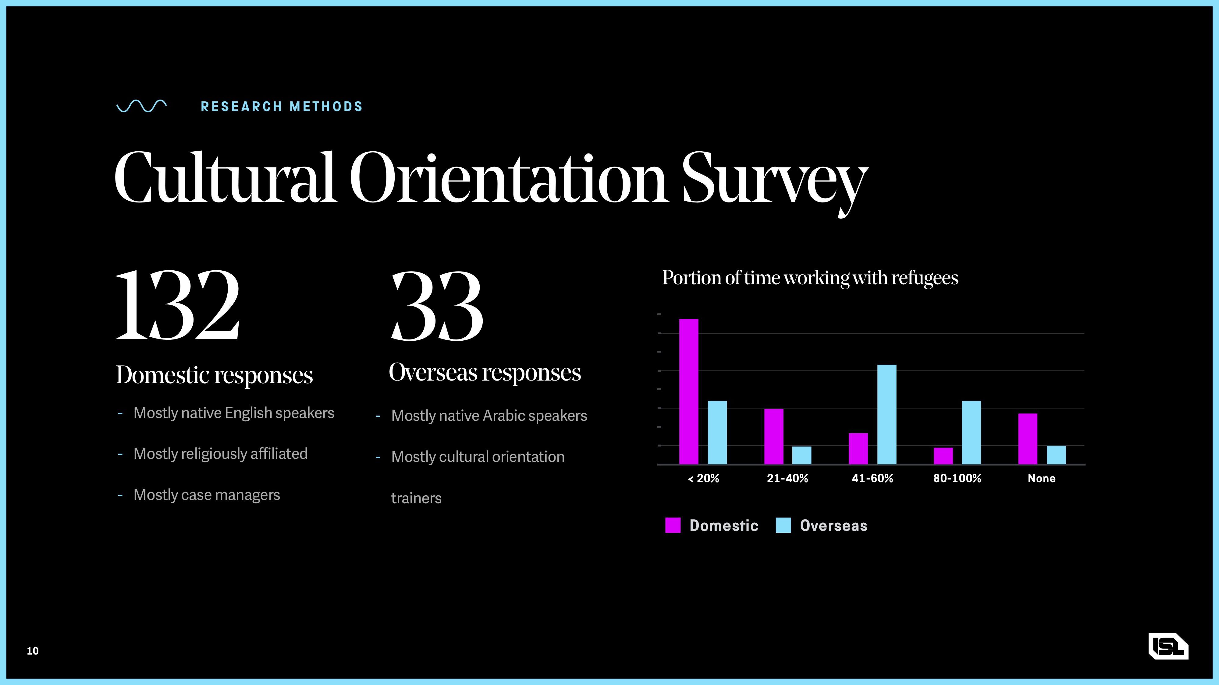
Summary of a CO survey to help determine who spends the most time with refugees at various points in the resettlement process.
Key takeaways
We learned that an internet connection could not be relied upon and that many refugees do not have access to a personal device. We needed to ensure that the experience was available offline and that the app could track individual learning progress across multiple profiles.
Additionally, given the current social climate — we needed to be careful about storing any personally identifiable information.
Comparative analysis
We carried out a comparative analysis to get a sense of the current landscape of digital products & services focused on cultural orientation and crisis relief. We needed to understand what other services were doing, how they were doing it, and who they were doing it for. When it came to the products themselves, we took stock of everything — supported languages, device platforms, geo-location services, security protocols, any personalization or gamification elements, and much more.
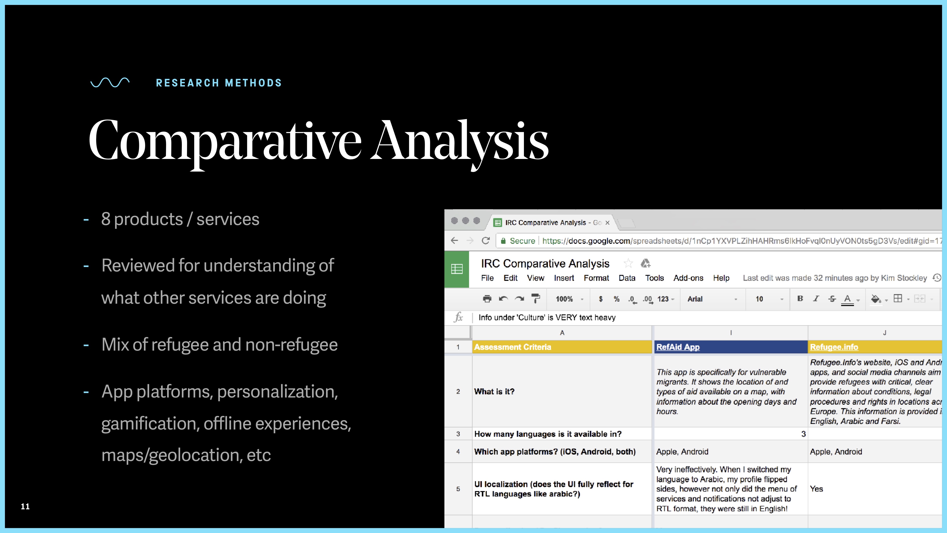
Summary of a comparative analysis that looked at 8 different digital products associated with resettlement or crisis relief.
Key takeaways
Many apps needed to support a multitude of different languages and that was no different for us. Safeguarding against any translation mishaps and ensuring that content is clear, concise, and communicated effectively across languages became a priority.
Provisional personas
We moved into a series of personas to build consensus around our intended audiences and their respective wants, needs, and frustrations. This was less of a design tool and more so an exercise that helped us summarize our findings from our stakeholder interviews and surveys. Our three main archetypes were refugees, CO trainers overseas, and case workers in the US.
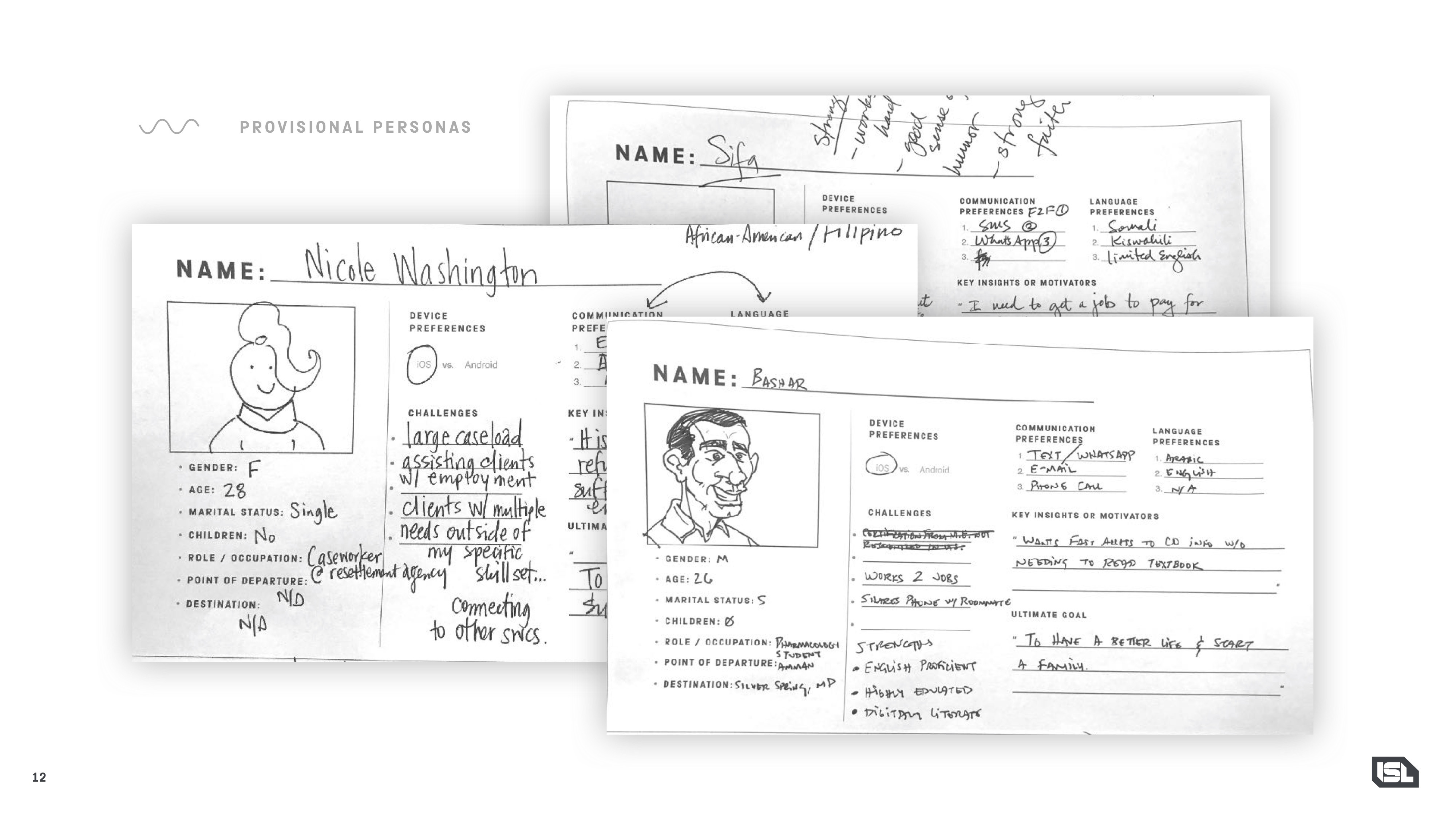
Some rough personas to help summarize our findings and build consensus.
Synthesizing our findings
Upon completion of the initial discovery phase, we arrived at a set of strategic insights that ultimately defined our UX and design direction for the entire product:
. . .
Designing the experience
Choosing a model
One of first hurdles we needed to overcome was creating a framework for providing CO content to refugees and ensure knowledge was being retained and applied to real world scenarios encountered during the acclimation period. We used some the current methods employed by CO trainers and case workers in resettlement agencies as a jumping off point, but later hit the books and took to the internet to research effective teaching/learning models.
After a bit of hallway testing, we implemented the Tell, Show, Do, Apply learning model as a lesson framework for its proven ability to facilitate repetition and help users retain information over time. The sheer simplicity and efficacy of the Tell, Show, Do, Apply model naturally lends itself to mobile app design. This framework served as our North Star when deciding how to approach content for our lessons.
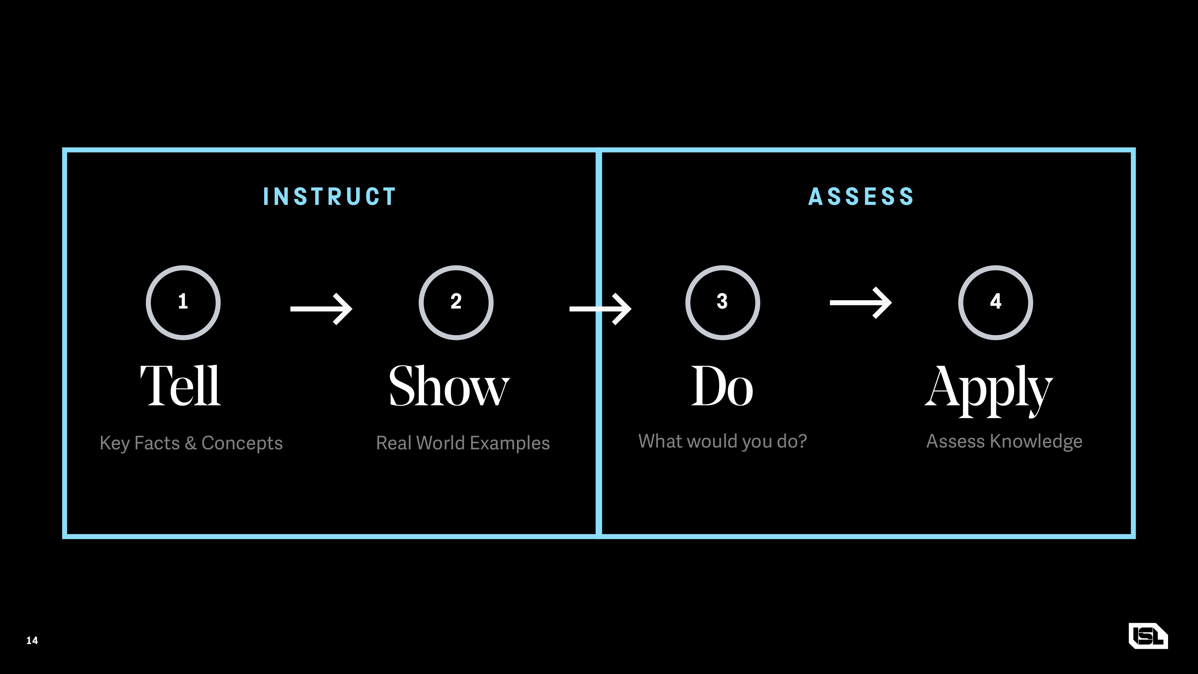
The Instruct and Assess framework helped us determine where to place instructional content and when to follow up with quizzes and real world application.
Giving control the user
To many, refugee resettlement is a sensitive, controversial process — especially from a privacy standpoint. Due to user confidentiality precautions, it was too risky to store personal information in the application. Instead, we made it easy for users to skip around to lessons that interest them or pick up where they left without having to log in.
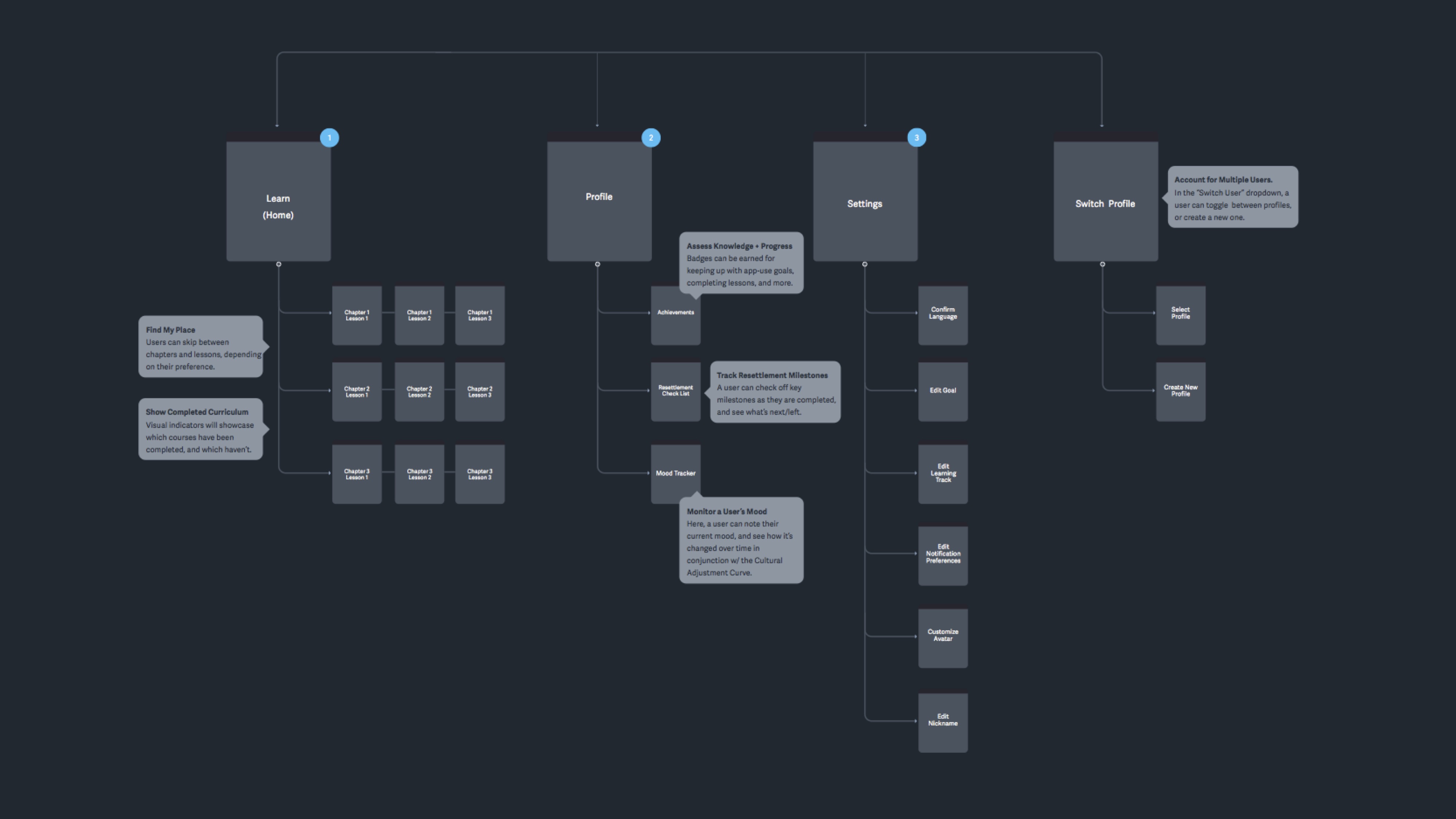
A user flow showcasing the intent to allow users to start, stop, and skip chapters at will but still maintain a sense of progress.
Wireframes
Multiple rounds of wireframes soon followed. With the basic app flow already planned, most of our time was spent iterating on the learning modules, trying to strike the right balance between “inform” & “assess” content — and any key interactions needed to convey our ideas. This was an arduous process that eventually resulted in six templates that could be combined and used interchangeably with different types of content. For example:
Inform
The three templates for all informative content:
- Rotating carousel for imagery and written content
- Video/animation module with transcribed written content
- Long-form scrolling view for written content only.
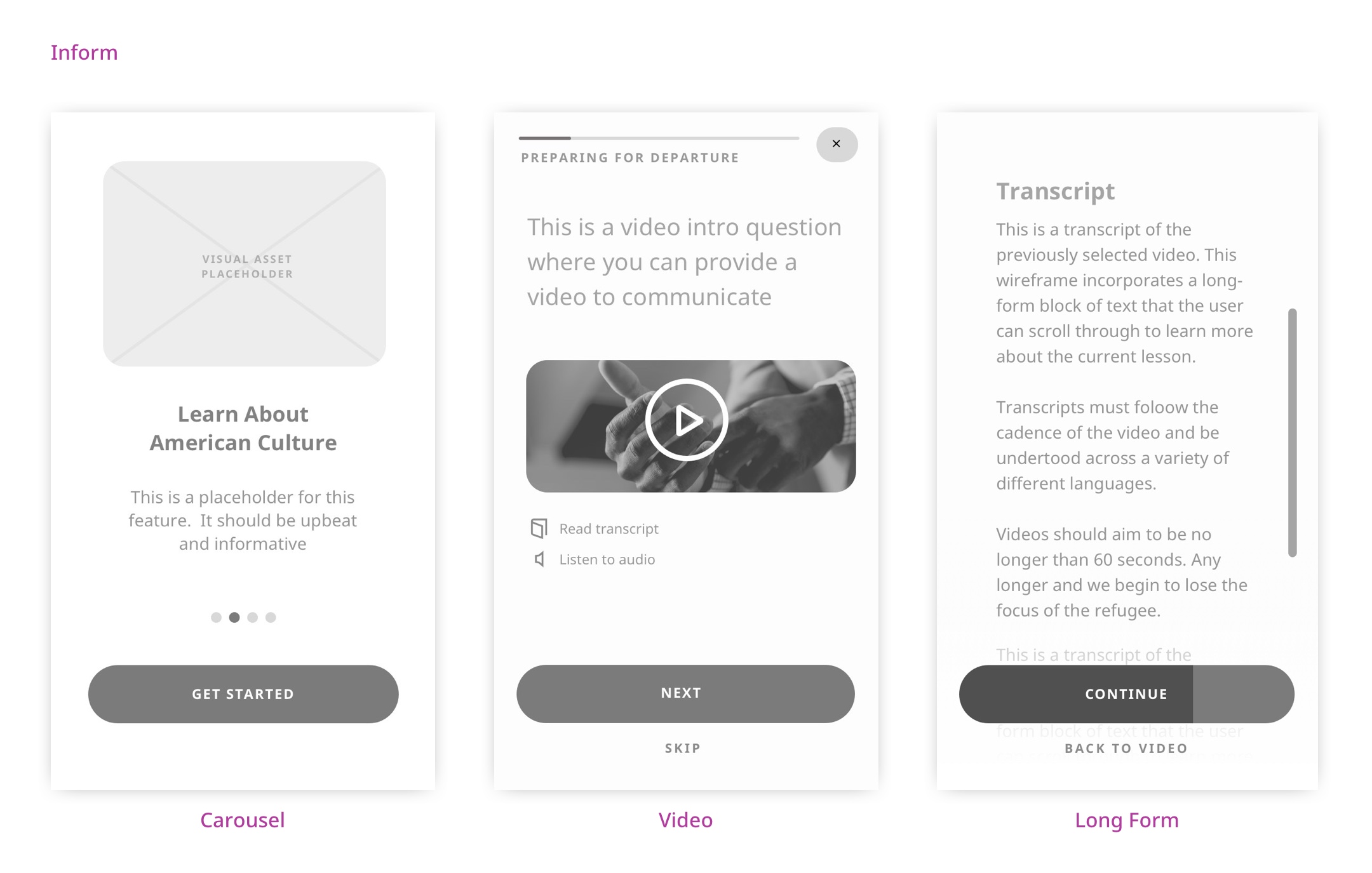
The Instruct and Assess framework helped us determine where to place instructional content and when to follow up with quizzes and real world application.
Assess
The three templates for all assessment content:
- Single answer presented in a boolean format (true or false)
- Single answer presented in a multiple choice format
- Multiple answer option in a drag & drop format
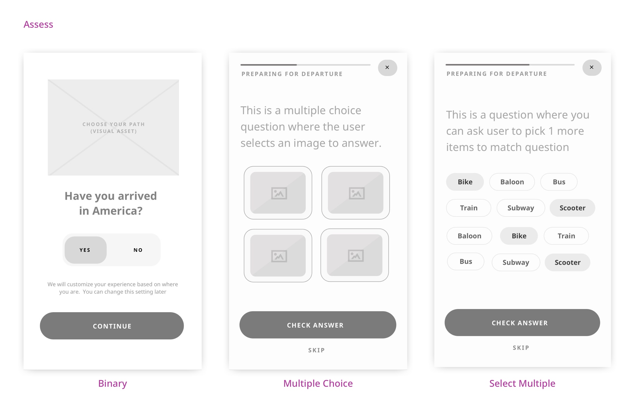
The Instruct and Assess framework helped us determine where to place instructional content and when to follow up with quizzes and real world application.
Building a CMS
Running in tandem with our design efforts, the dev team was hard at work at building a Wordpress based CMS — enabling IRC to update and add new orientation content to the app over time. The system needed to be flexible enough to allow for multiple user groups with varying knowledge and permission levels, but provide enough rigidity and parameters to ensure content is always in it’s “most ideal” form before being pushed to the app.
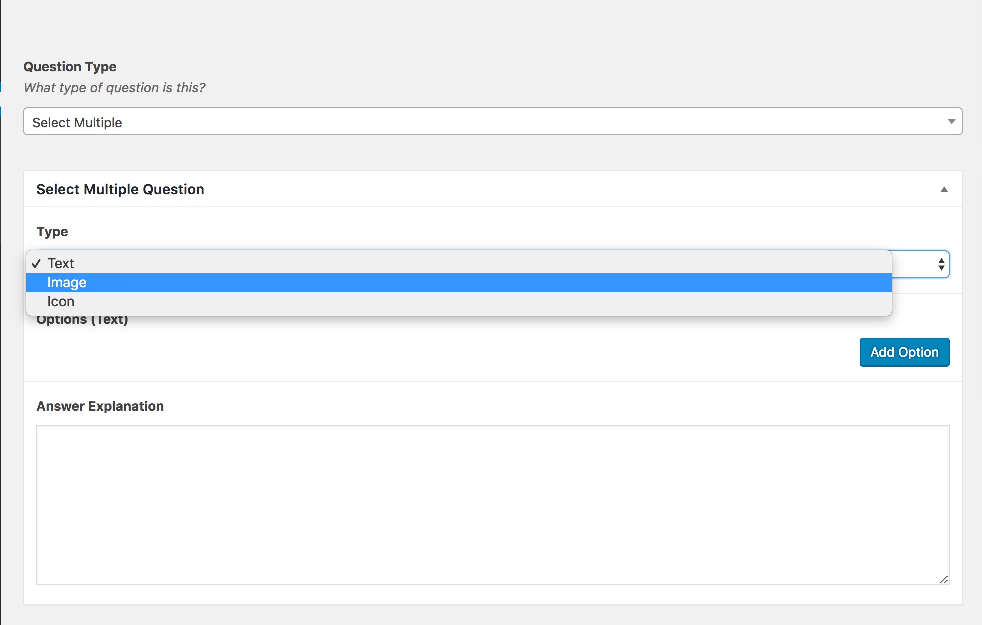
Creating an assessment question through the CMS.
Beauty and accessibility
We began by branding and naming the application, landing on SettleIn – a reminder to the user that the app is meant to be a comforting mechanism to own and understand your resettlement process. From there we designed a universal iconography set, which mimicked airport way-finding, and an accessible color scheme, devoid of colors representative of any particular nation.
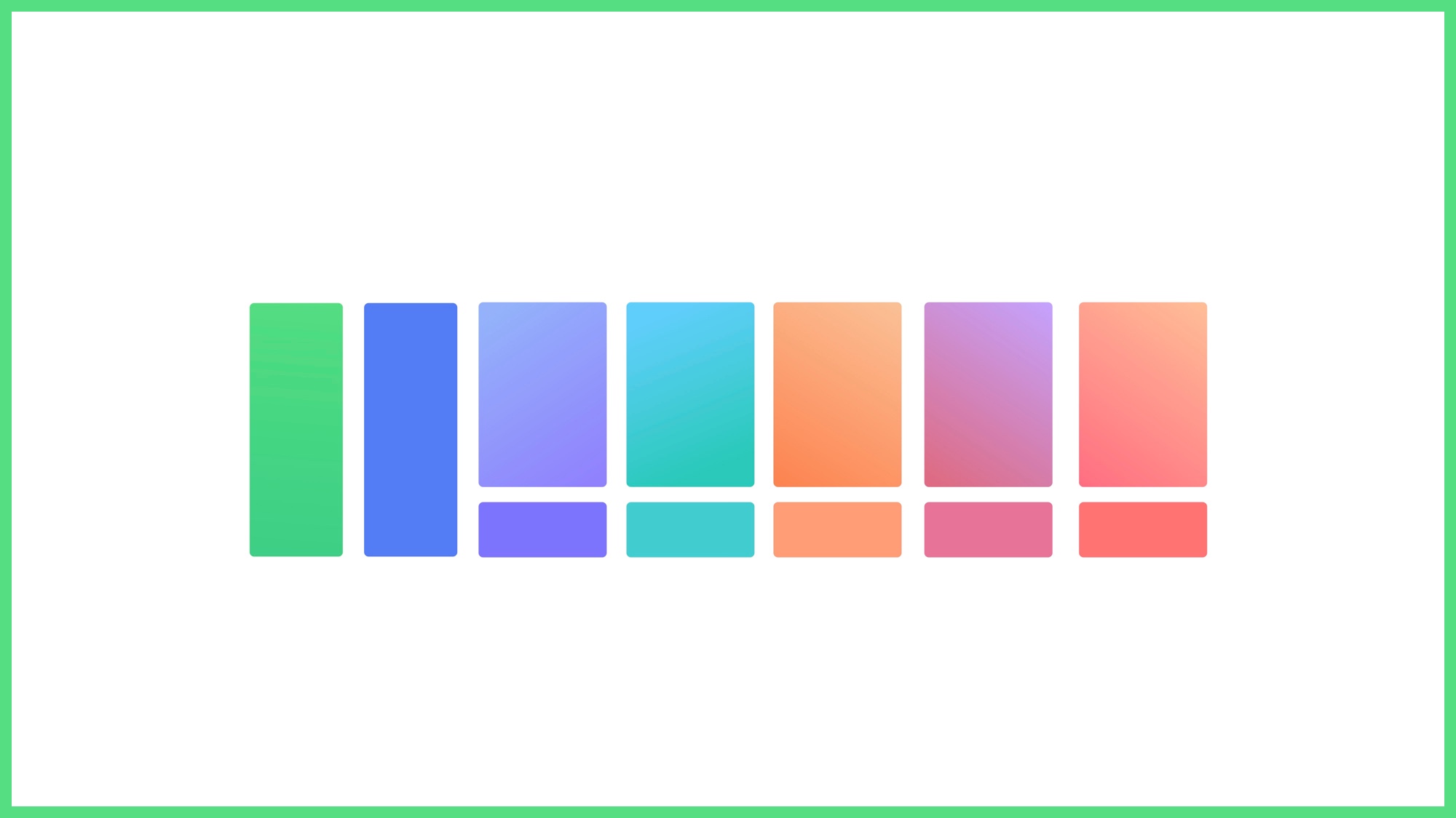
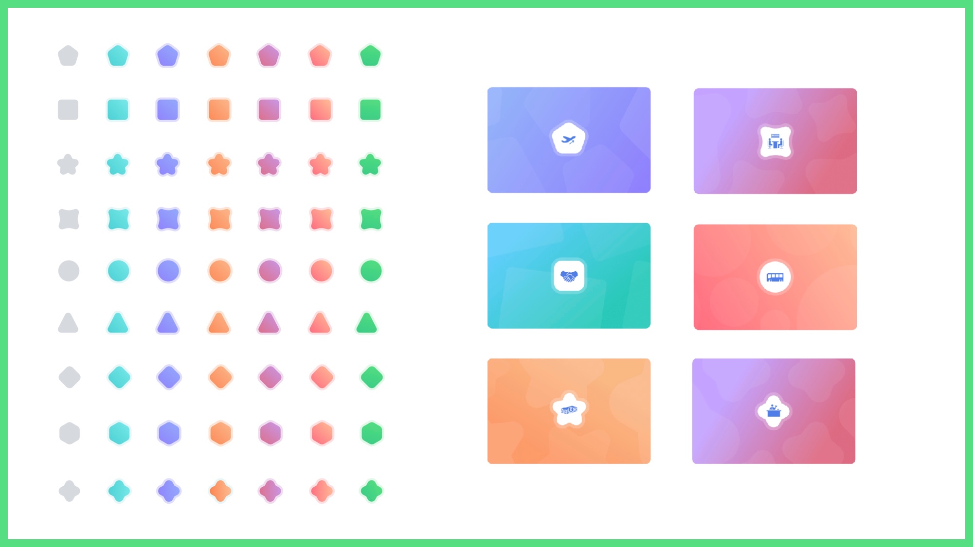
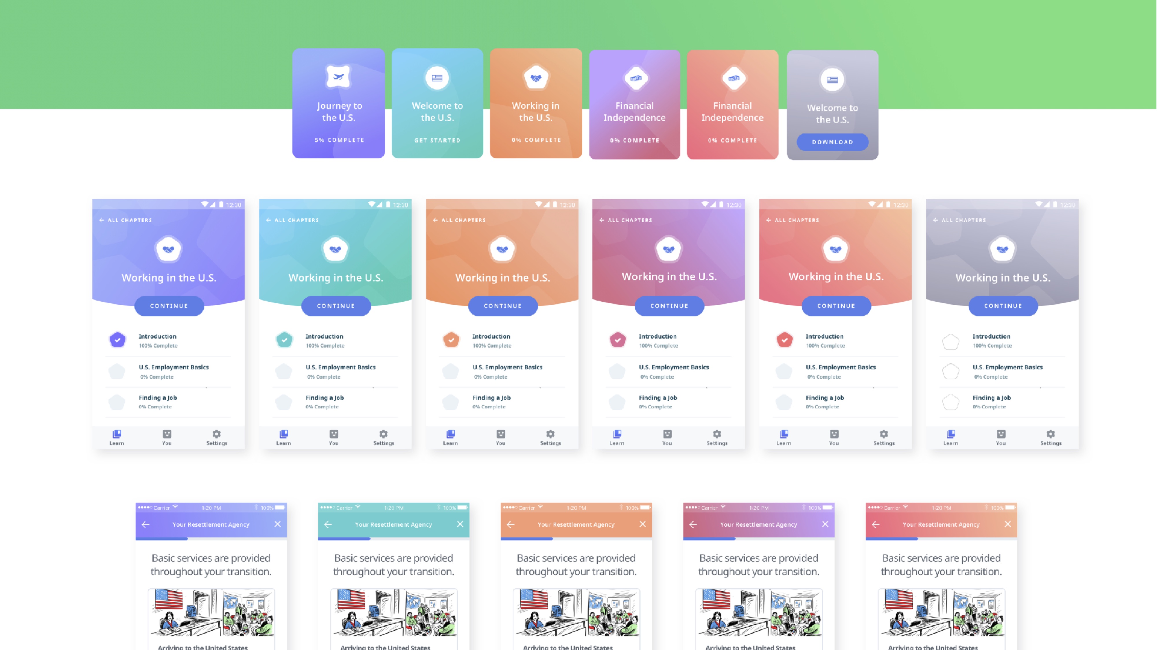
As the app scales and more chapters are added — our system of shapes and colors could be combined in hundreds of different ways to create a unique identity.
Supporting multiple languages
SettleIn needed to support multiple languages (and even multiple dialects) spanning across the Arabic and Latin alphabets. We needed to ensure that our translated content was rendered correctly and easily legible — especially for elderly refugees and refugees with disabilities. Google has been hard at work at digitizing the Arabic alphabet and bringing it into the modern age, so, naturally, we pulled a ton of inspiration from them before settling on Noto Sans as our type of choice.
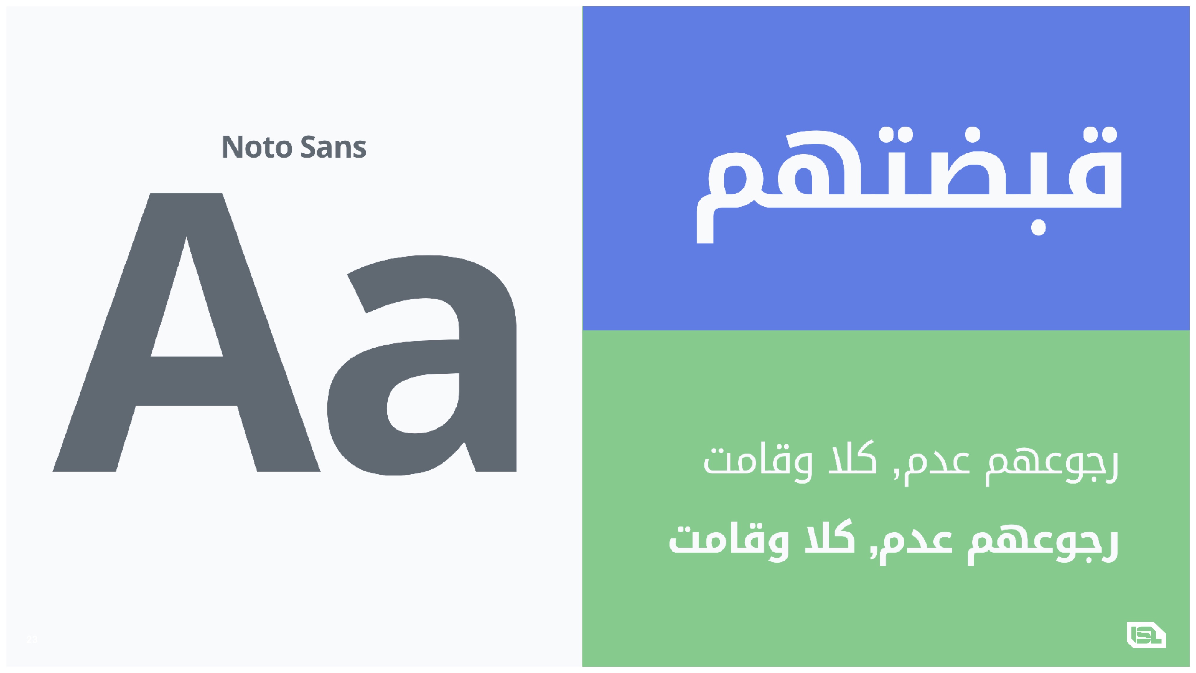
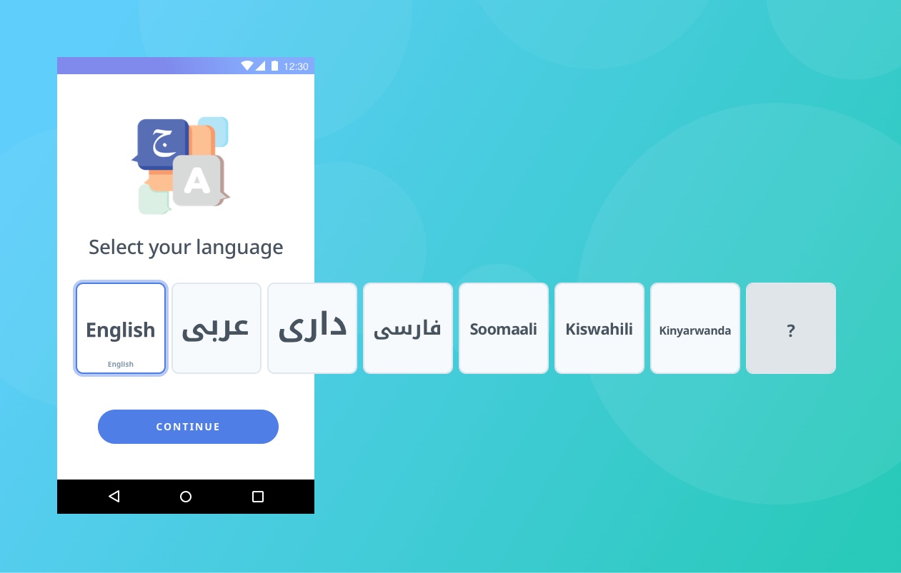
The final iteration of the language selection process — part of the onboarding flow.
Bi-directional design
Rendering the alphabet was only half of the equation. To fully account for all English & Arabic speakers, we needed to create a design system that enabled both left-to-right and right-to-left reading across the app and integrated curriculum.
We worked closely with IRC to develop a set of rules governing line-length, font size, and when to use formal vs. informal translations. We also integrated animated tool tips that added contextual hints as a fallback, prompting users using motion (rather than language) to access SettleIn’s features.
Phase 2
Usability testing
Usability testing is underway and we recently finished a round carried out by 8 refugees in Africa — 6 Congolese, 1 Rwandan, and 1 Sudanese. We were pleased to see that most users understood the general framework and purpose of the app — but there was some shared confusion due to insufficient context, CTA’s, and translation barriers.
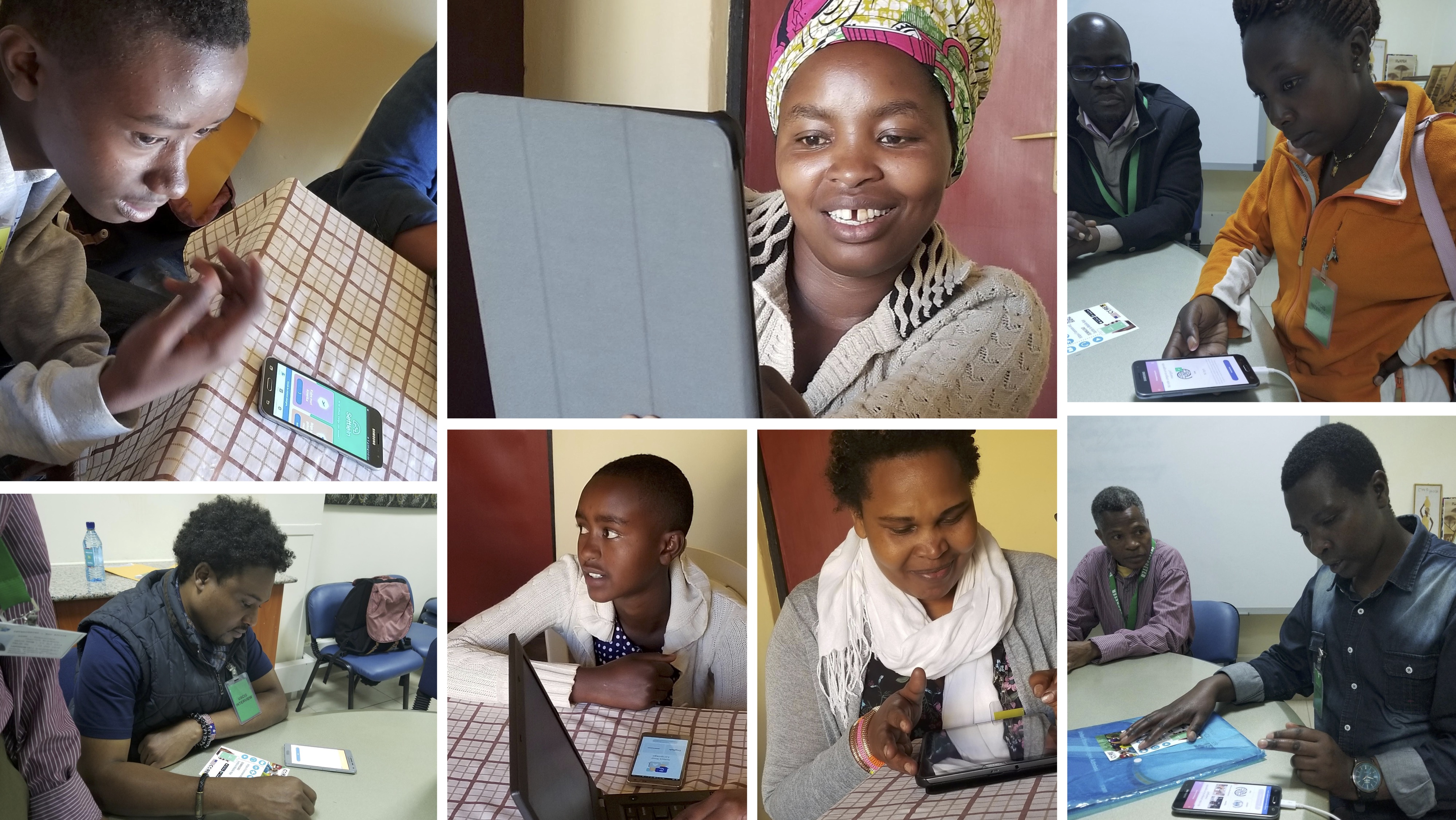
Usability testing carried out in Nairobi.
Next steps
Once the full round of usability testing has been completed, the team will head into Phase 2 for optimization and refinement. We identified a few key areas of opportunity from our tests in Nairobi:
- Reducing load times & app size
- Refine the multiple choice & select multiple assessment patterns
- Provide more context into chapters and their associated lessons
- Refine language translations
- Provide more moments of delight
Stay tuned
Check back in early 2019 for a recap on Phase 2. We’re making a ton of refinements across the board based off of feedback, adding more language support, and even gearing up to bring SettleIn to desktop browsers! More to follow soon.
Stay tuned! 🚀

Thanks for reading!
Matt Taylor
PS: If you're not a fan of the experience on my blog, head over to Medium and throw me a follow to stay up to date with all of my shenanigans.