Creating actionable investment goals
Introduction
Project overview
As part of a larger overhaul to the investor dashboard, the Fundrise team wanted to give investors the ability to set an earnings goal and create an experience centered around tracking and ultimately reaching that goal.
Up until this initiative, the dashboard only provided static reporting tools related to the users investments (capital invested, change over time, assets in their portfolio, etc). While functional, it’s not terribly interesting and doesn’t encourage high quality engagement or growth with the platform.
By creating a more personalized and interactive experience, we can put the investor in the driver’s seat, help provide them with a sense of accomplishment, and encourage them to take advantage of compounding interest. This is a multi-tiered process for the user, but it starts with allowing them to set a goal.
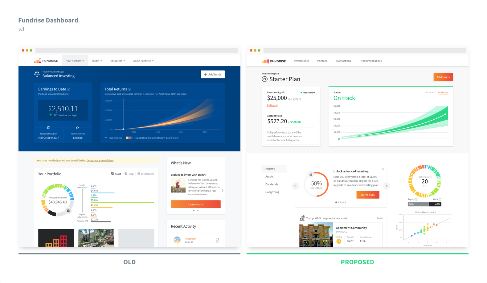
The redesigned dashboard.
Project goals
The overarching objective for this project was to increase engagement across the platform and foster longer term commitments from our investors. That could be broken down into:
- Increase overall average investment per user
- Increase auto-invest (monthly recurring) opt in
- Higher engagement with dashboard content
- Higher email engagement
- Promote user referrals
Design objectives
After a bit of background research and validation, we put together a loose framework for design objectives, expecting it to evolve over time:
- Create a goal framework utilizing our existing investment plans
- Design the “goal setting” experience
- Design a dashboard module to report status
- Design an onboarding experience for the whole thing
- Validate and test as early and often as possible
My role
- Discovery & validation
- User research
- Prototyping & testing
- High-fidelity design
Considerations before starting
While this is primarily a desktop oriented initiative, we still need to be cognizant of the increasing amount of mobile traffic and have a clean, non-watered down experience at smaller sizes. Additionally, this project was kicked off in tandem with a larger dashboard redesign, so we had to ensure that the team was effectively communicating and collaborating together.
. . .
Research
Stakeholder interviews
This was a relatively “blue sky” project that we haven’t attempted before, so I didn’t have access to a lot of data or user feedback to get the ball rolling. I conducted a few stakeholder interviews with business, product, and engineering teams to get a better understanding of our goals and timeline for the project.
Surveys
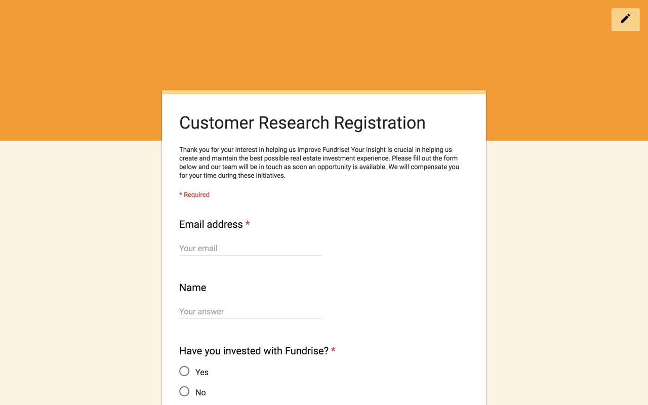
With a better understanding of our internal business needs, it was time to recruit some users for much needed feedback. We drafted up a series of surveys and questionnaires to be released via different touchpoints on the platform. We also included an optional sign-up form at the end of each survey for additional follow-up and future testing.
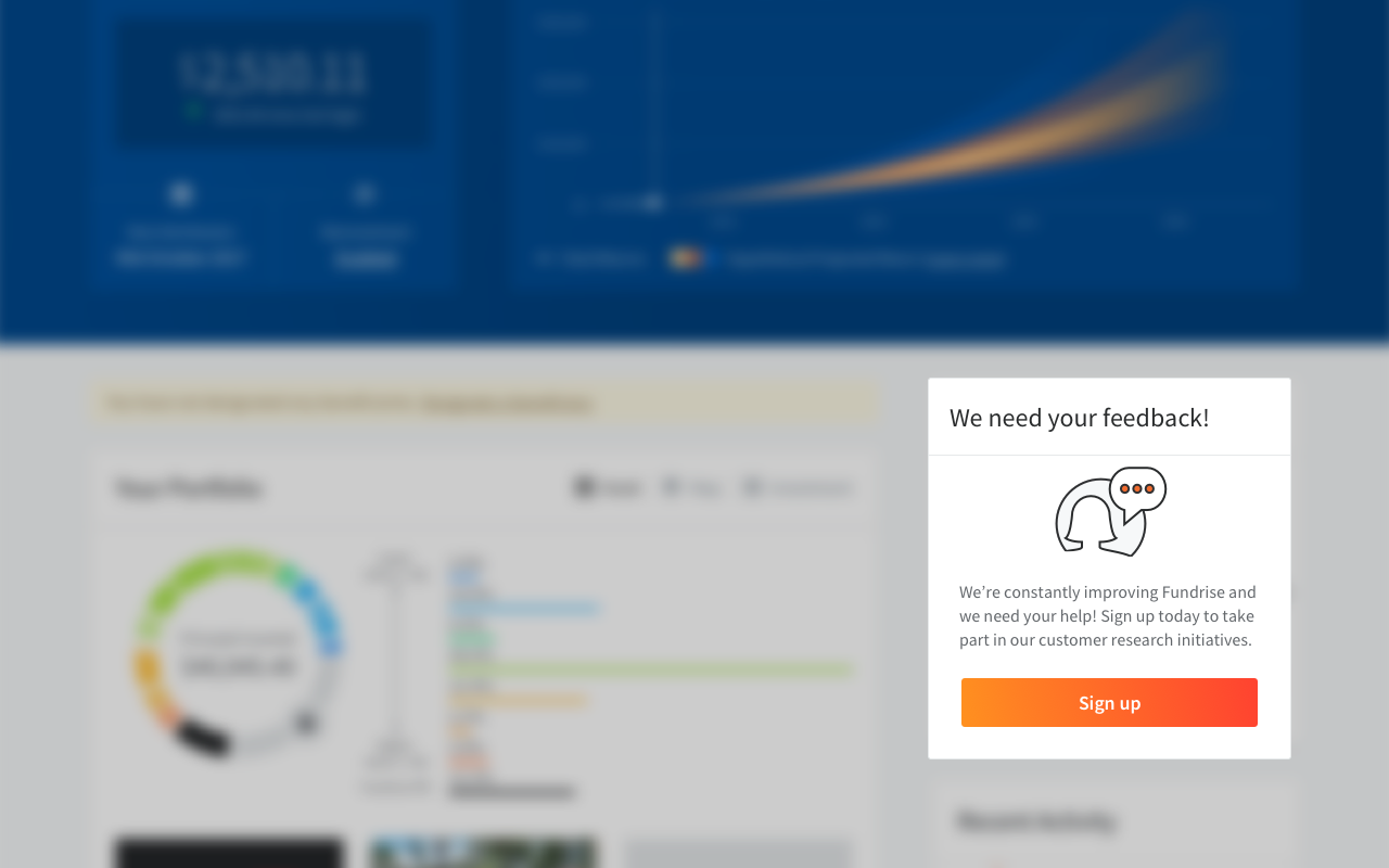
Early survey implementation for capturing interested participants.
User interviews
We reached out to a few people that opted for a follow up to schedule remote interviews. Here we were able to dive deeper and gather more contextual feedback.
Competitive analysis
I rounded out the initial research phase with an analysis on a few key competitors, focusing on experiences that offer goal setting or something similar as part of the core product. I wanted to focus specifically on what/how goals were presented to me as the end user, how easy it was to set a goal, and how accurately the goal reflects my needs.
Some other things I looked for:
- How do you think about your investment dollars?
- What is your goal?
- Would you take advantage of a tool like this?
- What would you like to see with a tool like this?
Takeaways
Income and assets
There are a few key pieces of information required to create an effective investment plan. This usually boils down to the investors current yearly income, cash on hand, cash already invested, and risk tolerance. No black sheep here.
Risk tolerance
Many services had subtle differences in how they formulated their plans and goals for the end user, but most used risk tolerance as the main underlying structure. This makes sense when using public securities such as stocks or bonds, but gets a little more complicated with real estate.
Real estate is generally riskier across the board, so the idea of "low vs high risk" isn't the most effective strategy when creating a portfolio.
Graphs galore
Investing is generally perceived as investing money now, and earning more money later. This concept lends itself well to a myriad of different line graphs and bar charts. Some services were more effective than others at visualizing the numbers in a “cognitively light” manner.
🚀🌖
Differing investment flows
Some services used the goal setting experience as a first point of contact, funneling users into the investment flow afterwards. Other services required a cleared payment before customizing further. In general we should aim to provide the user with as much value as possible before requiring any form of payment.
Analysis
Synthesizing the data
We compiled together our data from the survey responses, user interviews, and competitive analysis into higher level objectives to be referenced when building our framework. Some of our most important takeaways were:
Investment Life goals
People generally thought about investment goals within the context of other life goals — e.g.:
- Retirement
- Buying a house
- Kids college tuition
- Passive income
Thinking about the future
Most of the users we spoke to understood the value of compounding interest, but it was difficult to think about their needs 20+ years into the future and didn’t feel actionable or rewarding in the present. This is big issue for investing altogether.
Set it and forget it
A lot of our users are, predictably, more financially savvy than the average person (and more risk tolerant). This means total control and portfolio customization is of the utmost importance. However, this is steadily trending in the other direction. A majority of the population doesn’t want the hassle of actively managing a portfolio and would rather have someone else do it for them.
Creating a framework
Now that we finally had some data to work with, we started thinking about the (then) current state of the platform and how to go about designing a solution that’s within our constraints and timeline.
Utilizing the unique investment criteria behind our different plans (Long-term Growth, Balanced Investing, Supplemental Income) and the various motivations uncovered from our research, we were able to iterate through a rough framework to serve as a base for the experience.
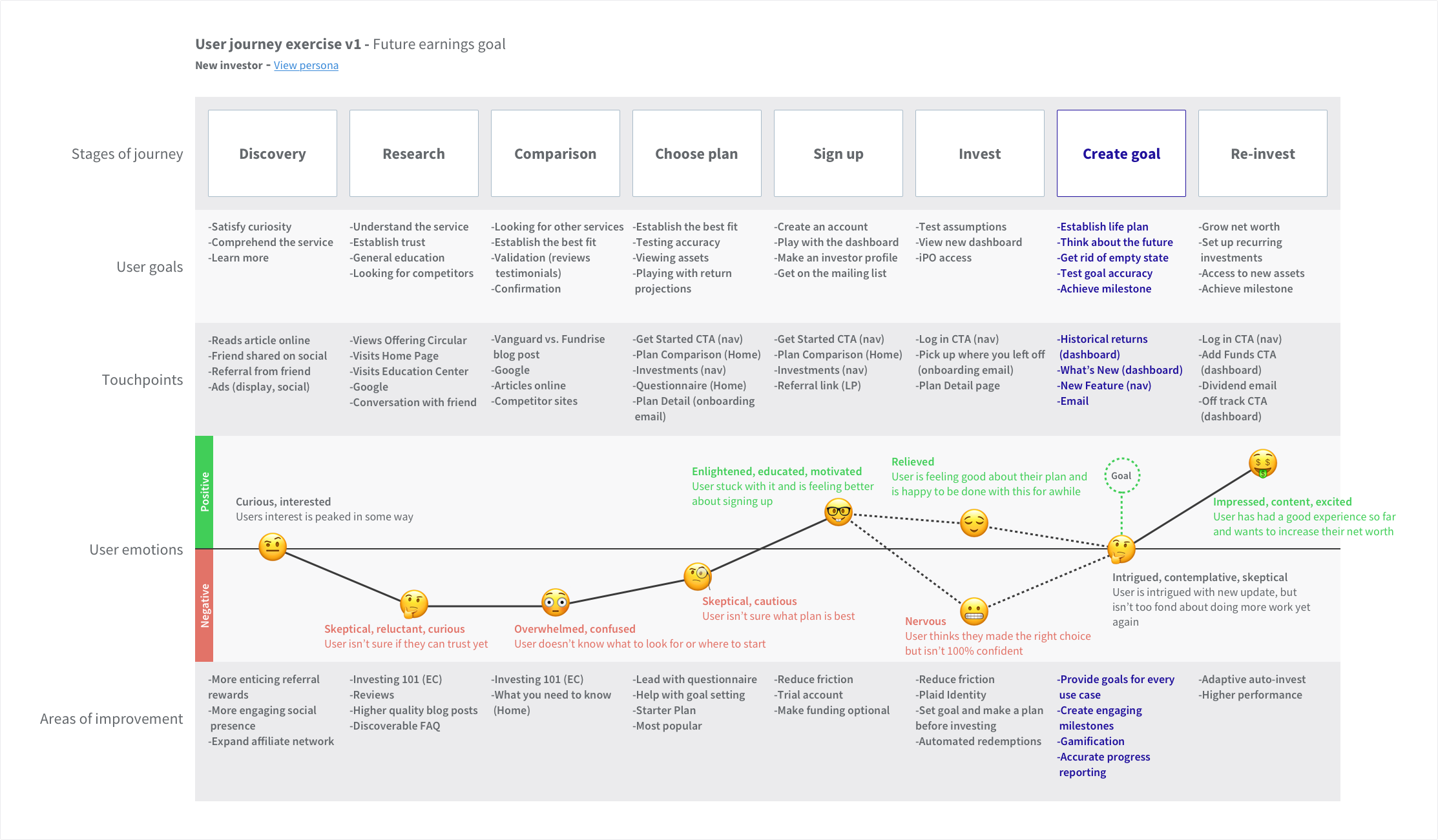
User journey map
With our framework in place, I created a basic user journey to help the team visualize how a new and existing investor might interact with this experience, as well as the emotions involved along the way. This was meant to be a high level reference to keep the team on the same page. We needed to understand the different thought processes and identify potential pain points.
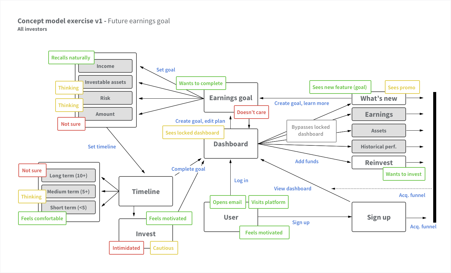
Concept model
Another important internal reference was the concept model. This model was created to help the design and development team figure out the general scope and implementation strategy for this feature (what does creating a goal actually look like?). Like most of these early artifacts, it evolved over time as we refined.
Designing the experience
Creating the MVP
We presented our findings to key stakeholders in a follow-up meeting and started to plan out an initial MVP and sprint schedule. We had a shorter-than-normal timeline for this project so we needed to be able to test and iterate quickly whilst keeping a narrow scope. In general, we aimed for something along these lines:
- An onboarding flow into goal setting for new investors
- A dashboard flow into goal setting for existing investors
- Visual representation of current earnings vs. goal
- The ability to edit the goal at any time
- Progress tracking (on track vs. off track)
- Plan of action to achieve success
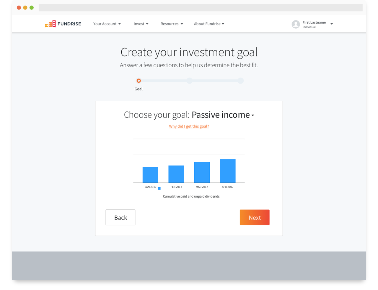
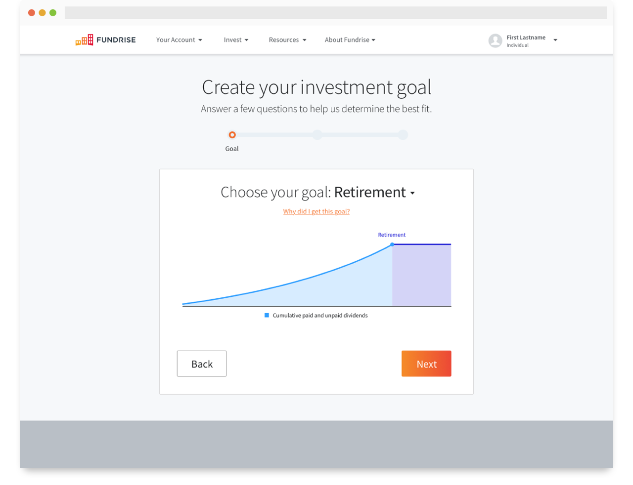
Sketching
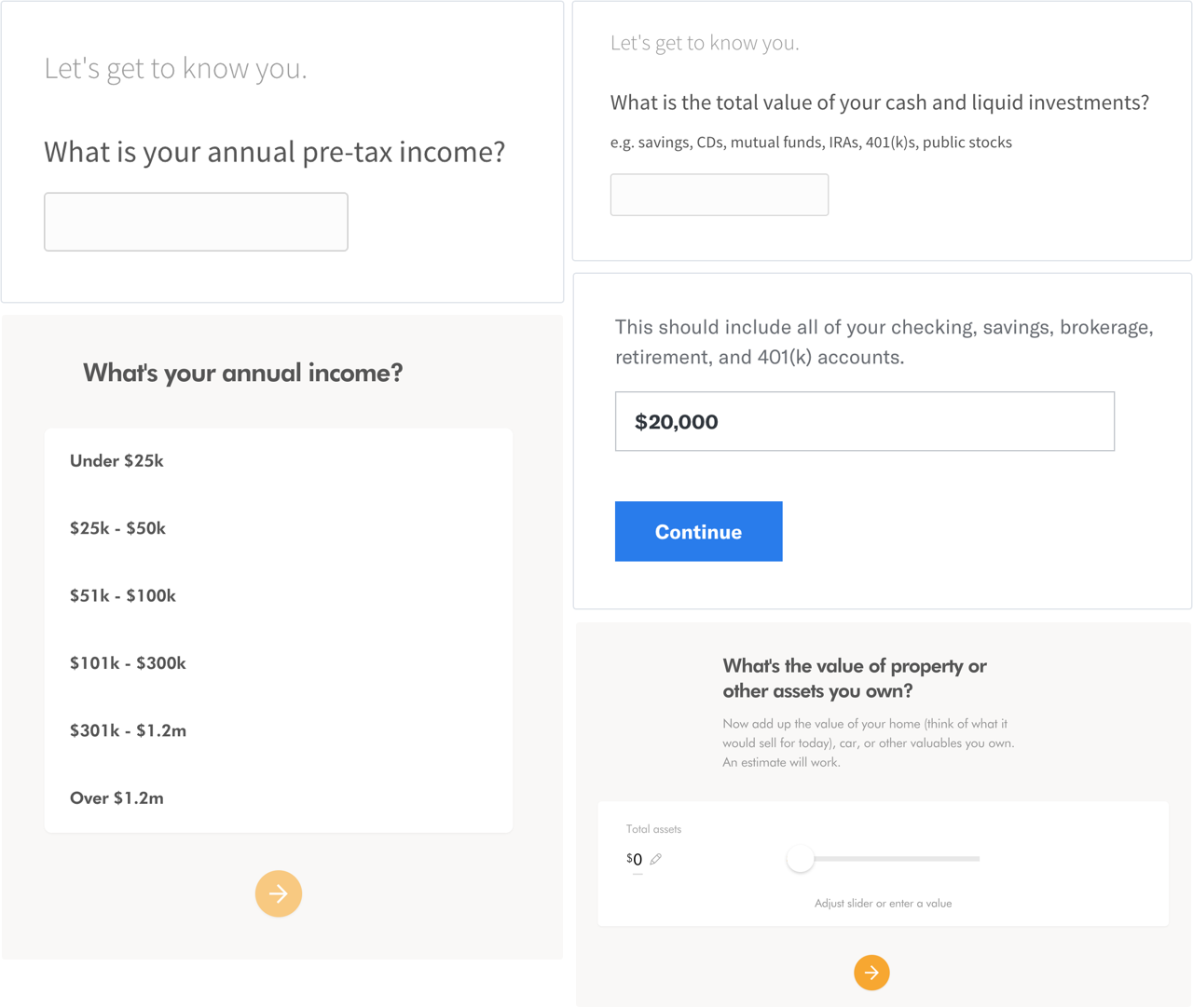
Armed with our user journeys, an updated user flow, and a plan of action for the MVP — I sketched out the various screens and interactions. I started with the onboarding flow and moved into the dashboard module (mobile and desktop), experimenting with different layouts and getting feedback along the way. Early on, the team established that I should aim for 2-3 variations on the overall flow for comparison and testing.
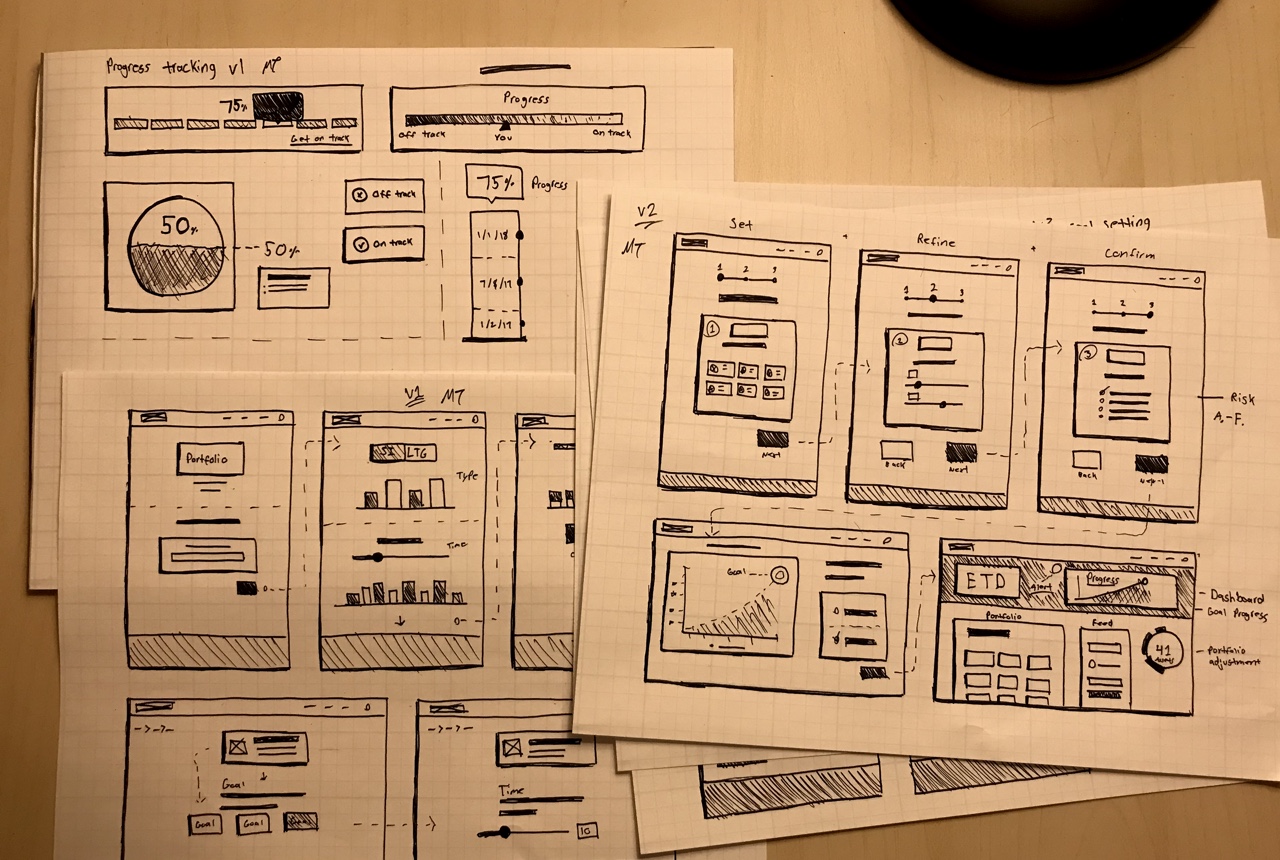
Early iterations of the onboarding.
Prototyping
We didn’t have a ton of time for a traditional “wireframing” phase, the objective was to keep the initiative lean for ease of implementation. After initial feedback on the sketches, I took advantage of our growing pattern library and jumped straight into prototyping with Sketch and InVision.
The goal was to have two prototypes ready for moderated testing around the office, and unmoderated testing online by the end of the sprint.
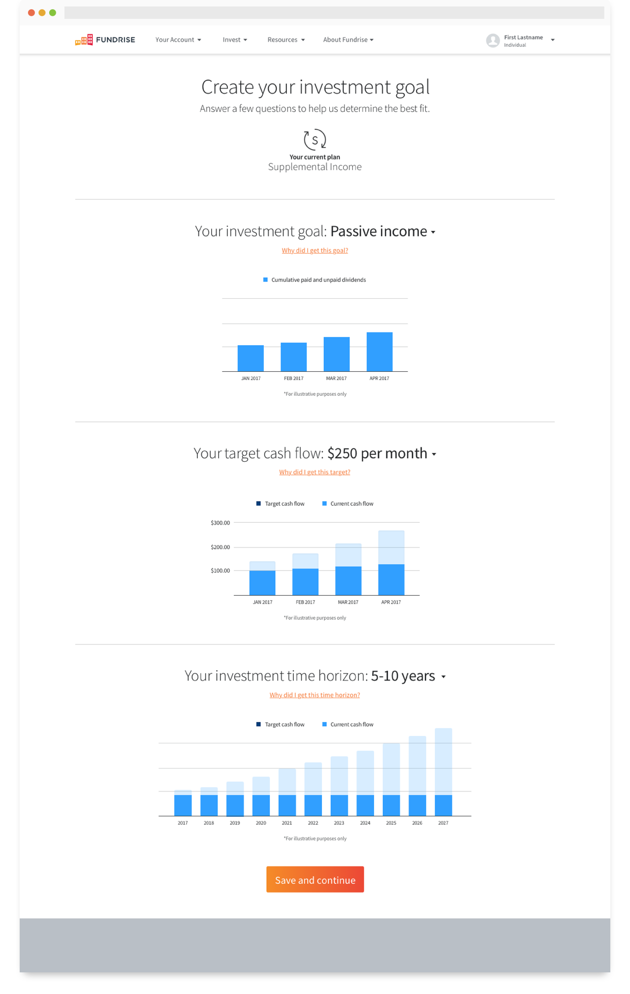
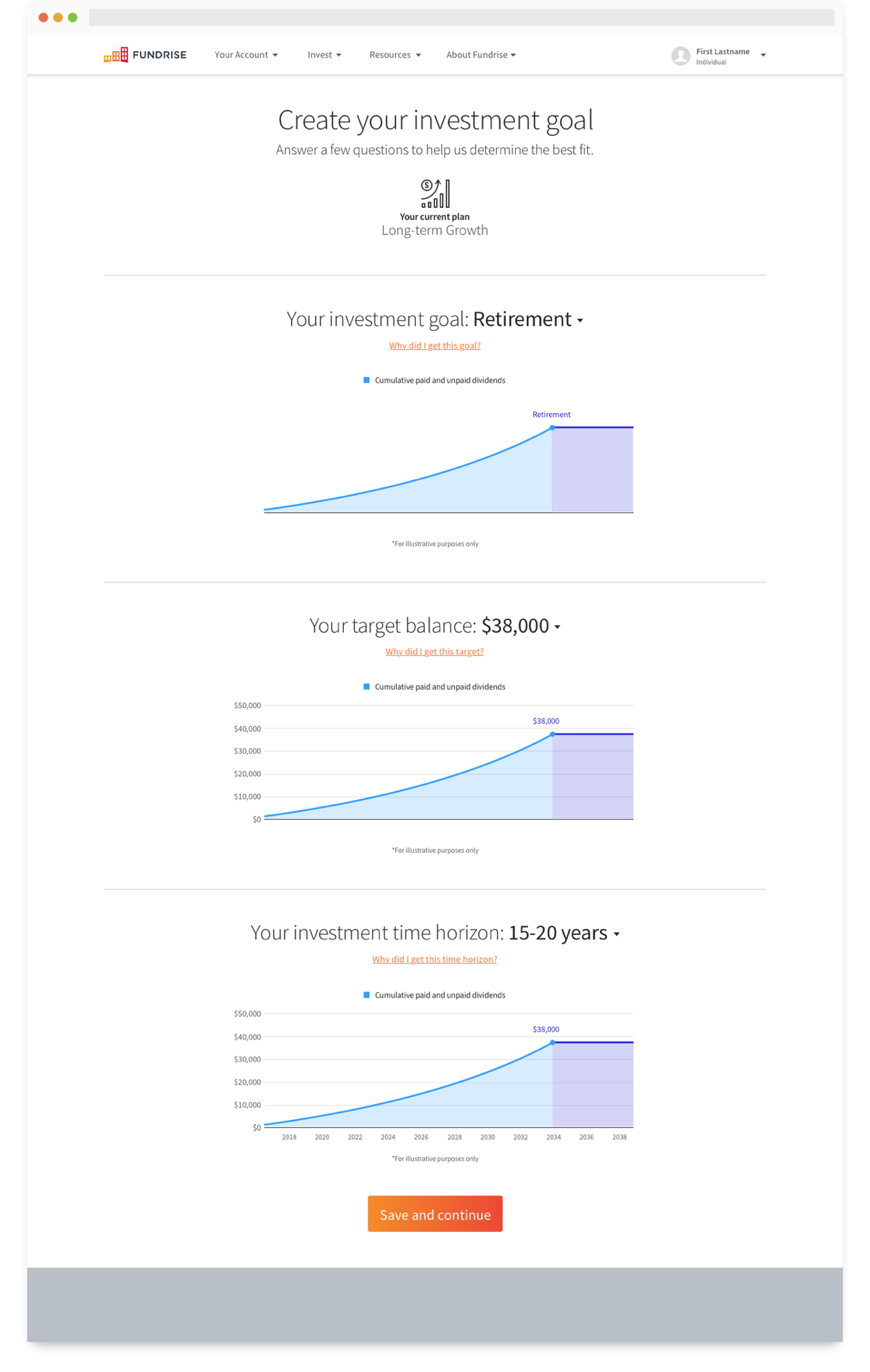
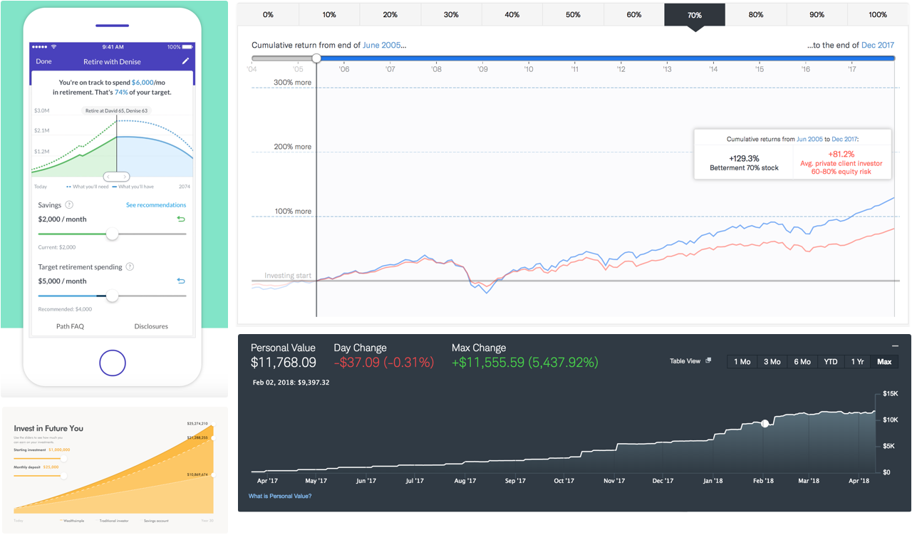
Data visualization
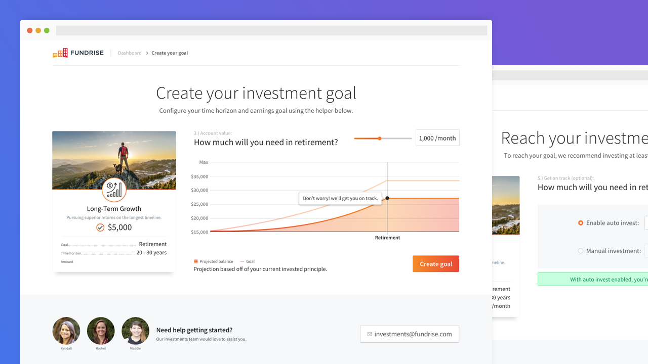
One of the most important facets of this entire experience is providing an engaging and interactive visual representation of the investors goal. We needed to convey a plethora of information, such as the users current invested capital, earnings trajectory, their end goal, and their progress towards that goal – all in one holistic view from the dashboard.
A considerable amount of time was spent iterating through different designs and implementations of this data. We ultimately decided on a series of contextual graphs based off of their current plan (line graph for longer term goals, bar graph for monthly income goals, etc).
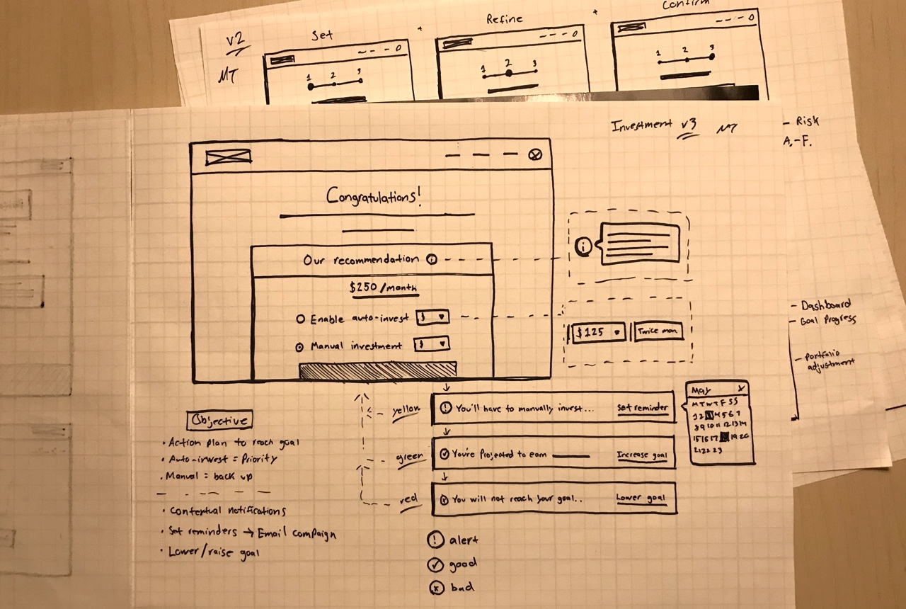
Rapid iteration
After preliminary testing, we settled on version 2 (the condensed version). With the deadline rapidly approaching, I moved the prototype into the highest possible fidelity given our current library — incorporating the feedback from our testing sessions. Future iterations were all made either at this fidelity or in code.
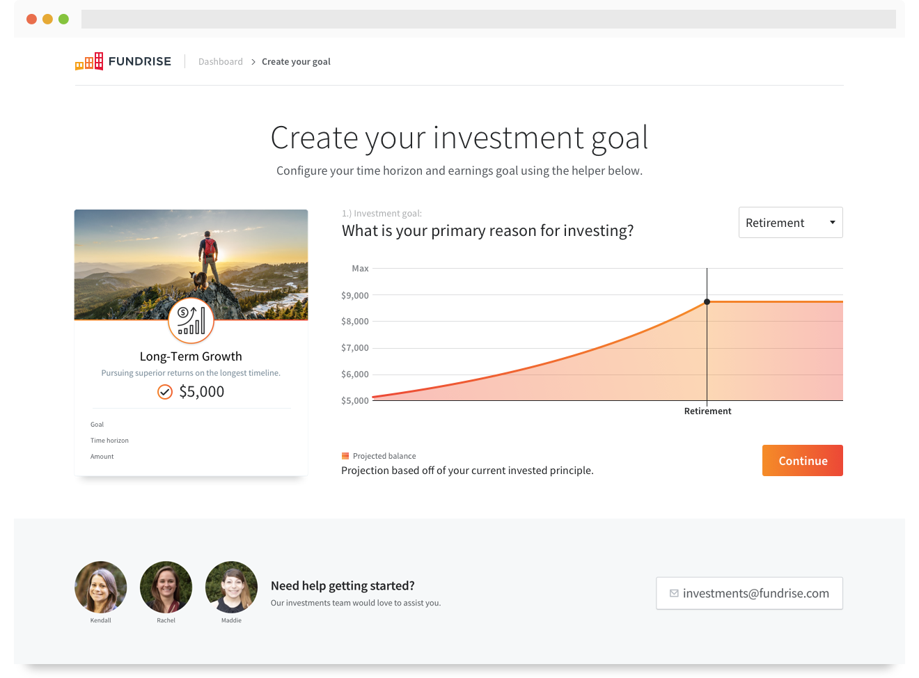
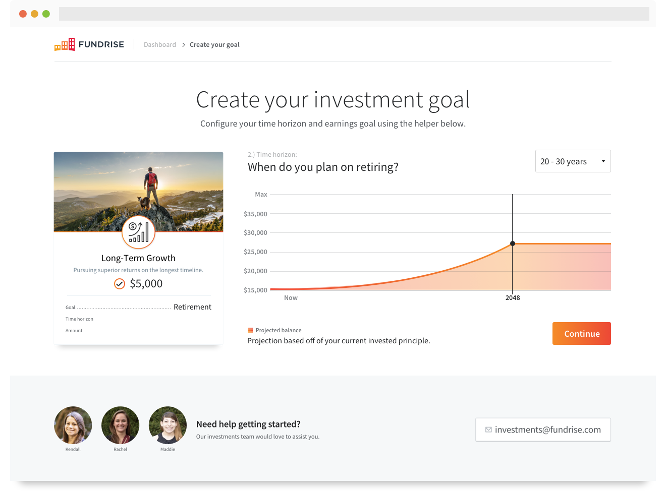
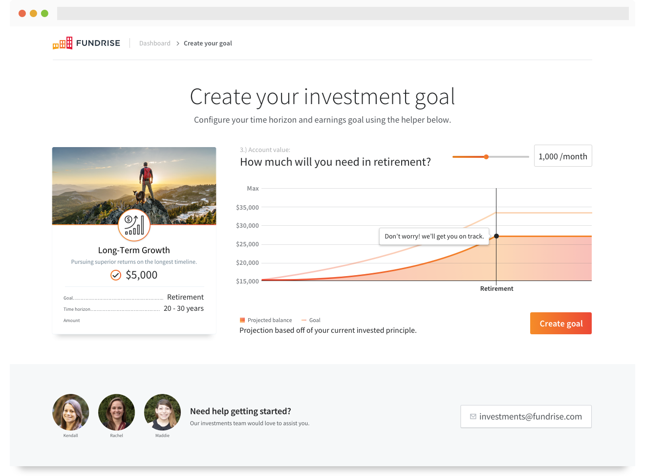
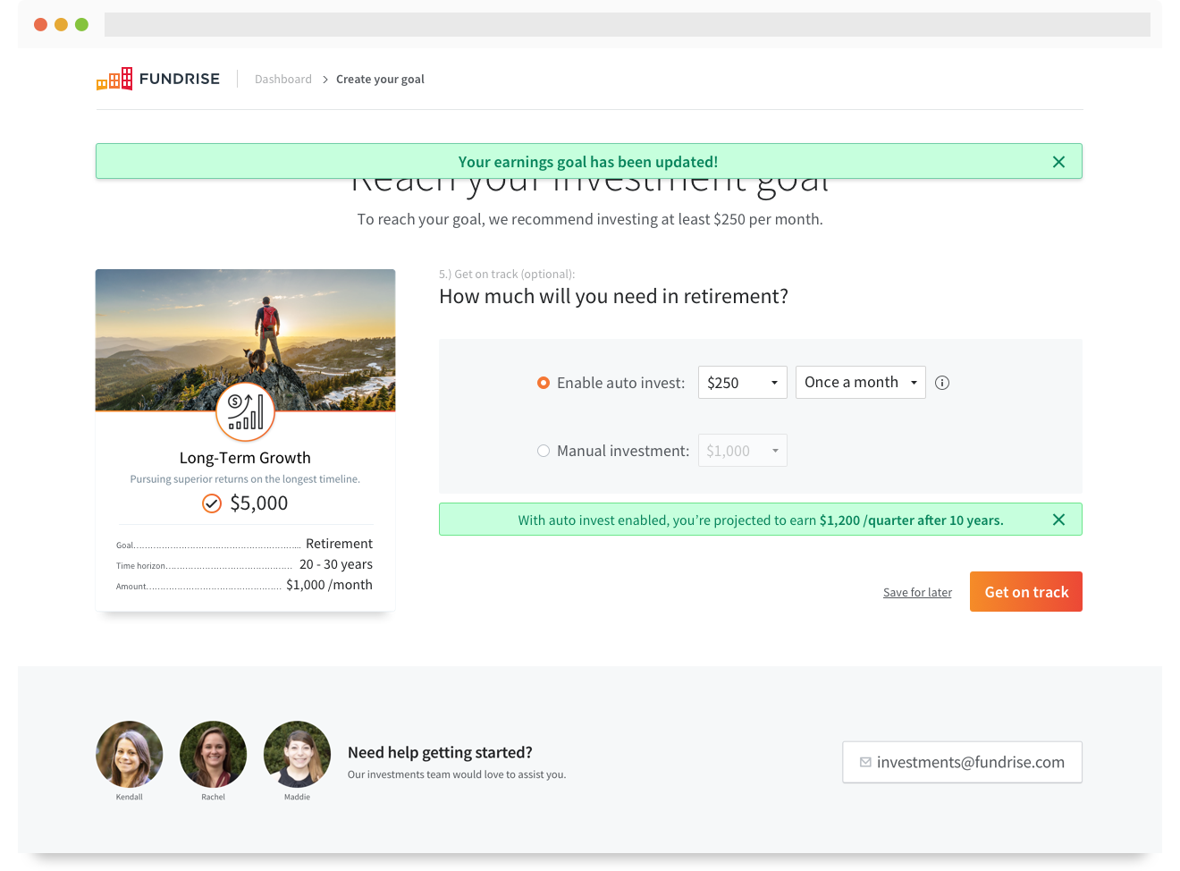
A few screens from the investment plan creation flow.
Development
The front-end and engineering teams were involved at various stages throughout the process, so providing highly detailed spec docs was unnecessary. I remained on the daily stand-up meetings and acted as general consultant through the dev process. As development was nearing completion, we organized a pre-alpha test on UserTesting.
Testing
Unfortunately we didn’t have as much time to test in high fidelity as I would have liked. Instead, I organized a moderated walk-through with stakeholders and any other interested team members for some initial feedback. We also set up event tracking with Google Analytics, Mixpanel, and Google Tag Manager to monitor patterns and set the stage for future testing.

Thanks for reading!
Matt Taylor
PS: If you're not a fan of the experience on my blog, head over to Medium and throw me a follow to stay up to date with all of my shenanigans.