Case study redux: Etsy Marketplace
Before we begin
This is an older case study that I completed during my time at General Assembly’s UX Design Immersive. Having been in product design for some time now, I thought it would be a fun and useful exercise to look back and revisit my process to see what could have been improved. This is the original, unabridged case study from two years ago – any text in pink are my present day reflections and insight. 🖍
Introduction
Project overview
Etsy provides a place for makers to sell their goods and reach a large audience. There are many talented individuals who are specially skilled in certain areas. Customers can search for the items they’re looking for, but sometimes they have a product in mind that they’d like created for them. My team created a concept that allows customers to post product requests and receive quotes from various artisans, as well as promote healthy collaboration between the two parties.
The mission
As a global marketplace leader that specializes in handmade items, Etsy wants to broaden its customer base even further through custom services. Our team was given 2 weeks to design a feature set and accompanying UI that allows Etsy users to post custom order requests and receive quotes from suitable Etsy shop owners. The feature set should be able to seamlessly integrate with Etsy’s current website and mobile app.
Already a pretty lofty goal, the Etsy website and mobile app have vastly different navigational structures, layouts, and cater to different user needs. 🖍
Considerations
There are many important aspects our team needed to take into consideration before beginning our research, and even more afterwards.
- What sort of time constraints should be placed on requests
- How can we help customers brainstorm and ideate with the artisan
- How do we ensure quality hits and not promote spam
- How will this compete with existing services in the industry
My role
- Preliminary discovery
- User research
- Wireframing
- Usability testing
Research
Gathering data
My team began the research phase by sending out a few surveys to Etsy customers and shop owners to get a better understanding of their needs and pain points. We then expanded our audience and started to poll people that have requested custom goods (or commissioned custom artwork) in the past, whether through an online service or a local shop.
User interviews
After conducting the surveys, we wanted to get more qualitative data via user interviews. We sat down with a few of our respondents and talked through the current process of requesting custom orders. We also wanted to learn more about the collaboration efforts between buyer and seller. Whilst my team compiled all our user data, I went online to the official Etsy forums and opened up further discussions about the current state of custom ordering.
Some excerpts from our interviews:
Q: Can you briefly describe your most recent experience with a custom order?
A: “I wanted to get my wife a necklace with her grandmothers name engraved on it, along with her birthstone. I spent a consierable amount of time searching for an Etsy shop that specialized in custom jewelry and requested a custom order through them.”
Q: What aspects were frustrating about your ordering process?
A: “Time was the big one for me. Between searching for the right jeweler and going back and forth trying to get the perfect necklace… I just felt exhausted by the time it was finally finished.”
Q: How did you collaborate with the shop owner? Was there any brainstorming involved?
A: “Mostly through email, I sent over some pictures of something similar and we just took it from there.”
Telling the story
User personas
We sorted our data from the research phase into two main archetypes; the buyer and the artisan. After identifying patterns in the responses we received, we then used the two personas to craft a pair of user stories.

The buyer persona, Sarah.

The artisan persona, Tim.
Buyer
Sarah is a 23 year old elementary school teacher that is preparing to start a new school year. She wants to order custom name blocks for her class to help them with seating arrangements and with learning each other’s names. Class starts next month so she needs to ensure the blocks will be error free and ready on a tight deadline.
Artisan
Tim is business analyst by day, but a talented woodworker by night. He’s looking to grow his woodworking business in hopes that one day he can turn into a full time job. Tim is a busy guy so he needs to be able to communicate with his customers on the go. He’s always on the hunt for new and exciting projects.
Overall, I think these were successful personas. We didn’t really have enough research for fully developed, bias free archetypes — but they address two categories of people that have significantly different motivations and needs when using the product. 🖍
User flows
Using the personas and user stories, we created a set of flow diagrams to illustrate the optimal “happy” path for each archetype. These diagrams served as a base for our wireframes, and allowed us to start thinking about any edge cases that we would need to design for.


Left; the buyer flow. Right; the artisan flow.
These user flows were a bit premature in my opinion. We should have spent more time analyzing both Etsy’s website and mobile app before creating an optimal journey. The IA and navigation are quite different in both experiences and probably warrant additional flow diagrams that take this into consideration. 🖍
Designing the experience
Sketching
Once we felt confident in our user stories and flow diagrams, I lead the design effort by sketching out a few initial layouts for sending and receiving project requests. On the buyer side, we needed to develop a way to assist the users in figuring out exactly what they want, even without any prior knowledge of the creation process. To make matters even more complex, we had to figure out a way to match the product request with suitable artisans who could provide accurate quotes.


Initial layout iterations for project listings and request screens.
Wireframing
After getting some ideas down on paper, we began the wireframing process with the product request. We needed to design a method that allows the buyer to describe what they want in full detail, or guide them through the process if they’re not quite sure. We settled on a hybrid form that first asks a series of basic questions to help categorize the request (product type, budget, shipping location, etc), then proceeds into more open ended questions to allow the buyer to add their personal touch (who is this for, what is this for, etc).


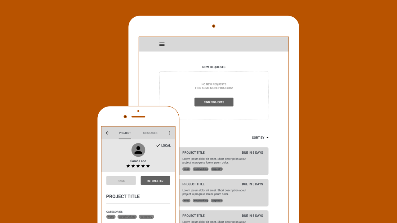
Reverse auction
With the artisan flow, we elected to create a sort of “reverse auction” concept. After some initial testing, we found that simply matching buyers with artisans by the highest bidder methodology left too much room for spam, and favored the larger and more established Etsy shop owners.
We devised a system that allows the artisan to actively seek new project requests, and choose the requests that interest them the most. When an artisan has expressed interest in a project, we’ll go ahead and open up the lines of communication so both parties can negotiate price and clear up any unanswered questions (we’ll cover this in just a bit!).
Ultimately, we wanted this system to put both the buyer and artisan on the same level to ensure quality matches and provide the best experience for both sides.


Project overview/search > Project listing > Project brief > Confirmation.
I stand by this design even today, but I’ve come to realize that this solution could still favor larger shop owners. Some of the more popular creators have multiple employees and a greater capacity to handle multiple orders. The reverse auction system does nothing to safeguard against this scenario, so I would want to test this hypothesis in depth and respond accordingly. 🖍
Promoting collaboration
Communication plays an essential role in this process. We can attempt to automate as much as possible using technology but when it comes to communicating abstract ideas, there’s no better way than human to human contact. The current tool is a simple email service connected with your Etsy account, but we wanted to implement something a little more robust. Together, we designed a real time messaging feature integrated alongside the project brief that provides a clear communication path and serves as a hub for important notifications.


Messaging + quote notification.
Prototype & testing
We created a quick prototype in InVision and conducted a few rounds of user testing. We focused on the navigational structure and general user engagement throughout both the buyer and artisan flows. We took diligent notes and carefully listened to the feedback, iterating after every round. We kept the prototype in a low-medium fidelity state to cut down on design time and eliminate any visual bias. View the prototype
Conclusion
Next steps
Quite a bit actually. Our testing and feedback was positive throughout most stages of the feature set. We’re headed in the right direction and have a solid MVP to begin scaling up to desktop size. Once the desktop versions have been tested and validated we can start to transition into higher fidelity comps and prototypes.
This theory makes sense on paper, but I think we failed to recognize just how different the mobile app and website experiences were (at the time). It wouldn’t just be a matter of progressively enhancing the mobile prototype — but designing an entirely different structure altogether. 🖍
The messaging feature is only scratching the surface of effective communication. We’re giving two parties the necessary tools to collaborate, but we’re not changing behavior. To solve this, we want to implement a system of checks and balances that allow the buyer to request timely status updates of their project. Ideally these updates should be in picture format for the most accurate representation of the current status. We feel this solution is a much closer step towards actively promoting collaboration.
Preach it. 🖍
Retrospective
More time and effort into researching the audience and establishing effective personas would have worked wonders for this project. I think talking to as many local shop owners as possible and making note of the dialogue between parties during commissions would have been eye opening.
Our team also spent too much time under the mobile constraint. We incorporated a lot of lean UX principles and had more than enough time to move into desktop design. We were so focused on getting the concept to work at the smallest possible size that we might have missed an otherwise obvious opportunity on a larger scale. 🖍

Thanks for reading!
Matt Taylor
PS: If you're not a fan of the experience on my blog, head over to Medium and throw me a follow to stay up to date with all of my shenanigans.