Case study redux: Ariva
Before we begin
This is an older case study that I completed during my time at General Assembly’s UX Design Immersive. Having been in product design for some time now, I thought it would be a fun and useful exercise to look back and revisit my process to see what could have been improved. This is the original, unabridged case study from two years ago – any text in pink are my present day reflections and insight. 🖍
Introduction
Project overview
Moving is tough. Whether it’s for a new job or just wanting to be closer to family, there are many factors that go into planning and executing a big move. My team and I designed a web app that matches users with suitable neighborhoods and provides them with an array of resources to assist throughout their decision making process.
The mission
Ariva is the brain child of two extraordinarily talented relocation specialists. For over 20 years, they have been helping people all around the world relocate and settle into the Washington metropolitan area. The job (and process) is exhaustive, tedious, and antiquated. Together, the co-founders are looking to develop a web app that automates a majority of their patented process.
Project goals
My team had 3 weeks to design a feature set and UI for Ariva’s new web app. The goal was to have something ready to develop within 3-6 months time after “handoff”. During the initial consultation with the client, it was evident that the original scope far exceeded what was possible in 3 weeks. Ariva is looking to cover nearly every aspect of moving, from basic needs like switching your driver’s license, to more complex concerns like identifying the right community to match your style of living. We spent a considerable amount of time narrowing our focus and fleshing out the core functionality for an MVP. From there, we established our design objectives.
Design objectives
- Create an “onboarding” process to capture relevant user data
- Design a UI that houses the results of the neighborhood matching service
- Create an organizational tool to aid in the planning phase of a move
- Design a UI that displays home listings for sale or rent
My role
- User research
- Sketching & wireframing
- High fidelity mocks & prototype
- Usability testing
Setting the objectives before gathering any meaningful user data was definitely a big flaw of this project. These objectives accomplished the immediate business and engineering needs, but not necessarily the users needs. With only 3 weeks, we didn’t have a lot of time to validate these features using actual data from their target audience. Looking back, I would have pushed for more time to get in front of potential customers before kicking things off. 🖍
Research
Gathering data
I lead the research phase by first conducting a large user survey to capture some bulk data. Looking at the results, I paid close attention to how frequently people were moving within a certain time period, the tools they used to assist them, and the reasons why they decided to move. Once I had enough data, I passed along my findings to the rest of the team. From there we started a competitive analysis and established market positioning.


Surveys showing how often people have moved within the last 5 years and the tools used.
Synthesis
After compiling our data, we reached out to our respondents for follow up interviews. We wanted to talk to the people that were frequently relocating and discover the root cause behind these moves. We also noticed a majority of our respondents elected to use local friends as a sole means of finding a place to live, even over the plethora of resources available online. My team and I found that to be a bit puzzling, and was something we needed to explore further.
Looking back, this doesn’t feel like the correct path. I would have focused more effort into understanding the actual moving process (from multiple personas) and the challenges each person faced, rather than causation for frequent relocations. 🖍
Key takeaways
- 40% of respondents were moving because of a new job or school
- 30% were moving simply because they were dissatisfied with their current place
- Many respondents leaned heavily on friends, family, and colleagues to help them find a new home
- Trust was the most important factor
- Friends provide first hand experience, security, and accountability
Telling the story
User personas
At this point, we’ve built ourselves a foundation to begin the design process. We organized all the data gathered during the research phase into an affinity map. The objective was to try and spot any obvious behavioral patterns and establish a visual representation of shared pain points. We took the affinity map and crafted three user personas that represented our target user base.


Sean the family man; Natalie the serial mover; Jordan the new grad.
We probably needed a little more data to effectively form these personas. Although these were based off of actual user interviews — the preliminary audience research that led to those interviews was noisy and skewed towards frequent movers. 🖍
User journeys
After finalizing our personas, we developed a set of user stories to address the common pain points. We created user flows in Axure to map out various experiences the users can expect to have when interacting with the Ariva web app. Ideally, we wanted to create a flow that directed new users through a planning phase (organizing, creating checklists, etc), an execution phase (finding a home), and an integration phase (settling in your new community). However, we recognized that not all our personas needed to follow such a linear path, so we also created flows that allow users to access each phase individually.
Designing the experience
Onboarding
Onboarding as a concept is overused and often executed poorly. We did it anyway. The Ariva matching service needed a specific set of personal data to function properly and we needed to develop a system that captured said data. To make matters a little more complex, we had to devise a way to keep our movers engaged and ensure their information was being used in a meaningful way.
We scheduled a follow-up meeting with the co-founders to get a better understanding of their process and the information they needed (and wanted) from clients. We left with a flash drive and a massive binder. After scouring through piles of documents for what seemed like an eternity, we formed a list of questions that served as a base for the onboarding.


Searching through an endless amount of files...
Screen first
Ariva is starting it’s journey as a desktop web app. There’s a lot of functionality happening behind the scenes that require a lot of input from the user, and significant screen real estate for effective output. From our interviews with both the founders and clientele — we determined that a mobile device was not optimal nor necessary to design for at that time. However, by keeping a responsive layout in mind and using a modular, component based approach to our design — we can make that eventual transition to a smaller size as painless as possible.
Yes! This was the correct line of thinking. Down with the mobile first ideology! 🖍
Sketch time
I began sketching various layouts and played around with different design approaches. I started with the onboarding process and followed the linear path we created in our user flows. After a few iterations of sketching, I organized a design studio with the rest of my team to get all of our ideas out onto paper. After a lot of back and forth, we finally started to refine the feature set into something a little more concrete. The session ended with a fleshed out onboarding system, a first iteration interactive task manager (more on this later), and a first iteration “neighborhood matching” page.


First round of onboarding sketches. Pens added for dramatic effect.
Wireframing & testing
This is where it gets fun. We started to incorporate some lean UX principles into our design process, test early and test often. I hit the ground running and quickly turned the sketches of the neighborhood matching page into digital wireframes. Like the sketches, these wireframes were intended to be rough so we could test the navigational structure and layout comprehension. We tested these pages alongside the onboarding to give our users some contextual background.
The feedback was positive! The onboarding was less intrusive than we had anticipated, and our users felt they were provided actual value from their input. Success!

Wireframe iterations of the neighborhood matching page.
We needed to test against our personas a bit more during this phase. If I recall correctly, we tested the prototypes with fellow students and few of our survey responders. If I had to do it again, I would challenge my team to get this in front of as many potential Ariva users as possible — people that are actually moving or have recently moved. Doing this might have helped us refine the onboarding even further. 🖍
The good stuff
High fidelity design
The main objective for the matching feature is to encapsulate the essence of specific neighborhoods and districts. Color, imagery, and iconography all play a vital role in this regard. With only a few days left, I was tasked with establishing a visual baseline for Ariva, and translating all wireframes into high fidelity comps.
These mockups also gave us another great opportunity for more user testing. We wanted to gauge emotional responses to specific types of imagery, color combinations, and language.


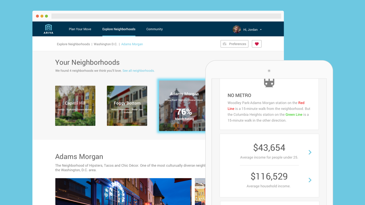
Hifi mocks of the neighborhood matching page for a sepcific city (DC).
Again, we needed to test these against our personas. How would Sean interpret this page? How would that differ from Natalie? How do their objectives change as they interact with the page? 🖍
How about that onboarding
I’ll say it again, onboarding kind of sucks. Usually there are better ways around it. In our specific scenario, however, that just wasn’t the case. Even trivial questions such as age prove to be a powerful asset (younger residents tend to live closer to the city center, older residents are more towards the outskirts). But Ariva is looking at more than just age and budget, it’s learning your personality so it can find the perfect lifestyle fit.


Hifi mocks of the initial onboarding flow/questionnaire.
Mapbox integration
An integral part of any move is finding a home to live in. Looking back at our research, it was often the very first thing people did when deciding to move. Ariva recognized an opportunity to integrate with Mapbox to allow users to browse through real listings right from the Ariva web app. We implemented a high level version of what this might look like into the neighborhood matching page.
The goal here is to dynamically filter out content based off the user preferences set by the onboarding process. For example, Sean (one of our user personas) is looking to upsize his current home in preparation for his brand new baby. Ariva would determine that school quality and location is probably an important factor going forward, and adjust the map accordingly based off of those criteria. Same scenario with housing, when Sean wants to see his housing options, he’ll be presented with the best fit using his preferences.


Dynamically filter through a variety of options and view real estate listings.
These mockups also gave us another great opportunity for more user testing. We wanted to gauge emotional responses to specific types of imagery, color combinations, and language.
Conclusion
Results
Our client was beyond thrilled with what our team managed to design in the 3 week sprint. It was a properly challenging experience, yet we managed to validate our research and solve for many common pain points associated with relocation. Development is already underway and we expect to see parts of the onboarding process and the neighborhood matcher implemented within 6 months time.
Challenges
Feature creep. Feature creep. Feature creep. Our team attempted to solve for a lot of problems, perhaps too many. From the moment we left the kickoff, maintaining a narrow focus proved to be difficult. Our task manager, along with some other great ideas were thrown on the back burner because we simply didn’t have enough time.
Retrospective
With a little bit of hindsight, I would have really pushed my team to focus on only one or two MVP features and validate as much as possible before defining concrete objectives. Doing so would have given us stronger insights into Ariva’s audience — which would have helped us develop more appropriate personas. Preferably personas with distinctly different goals to solve for.
Additionally, narrowing the audience pool before beginning our research would have helped us gather a more robust set of data. We would have benefitted from being a little more pragmatic during stakeholder meetings — asking more open ended questions and pushing them to think about the smallest subset of people that would see the largest benefit from Ariva’s product.
Looking at the actual deliverables, the onboarding could stand many more iterations. It’s functional and provides the platform with the correct input, but I think there are easier and less obtrusive ways to gather the required information. Utilizing social media, or only asking for information when it’s contextually relevant to their interactions on the platform are two things that come to mind.
The neighborhood matching page was a useful exercise in setting a visual base for the overall product, but ultimately not relevant to the tasks at hand. There were many other core features that needed to go through further rounds of testing and feedback before high fidelity visuals were necessary. 🖍

Thanks for reading!
Matt Taylor
PS: If you're not a fan of the experience on my blog, head over to Medium and throw me a follow to stay up to date with all of my shenanigans.