Building a better checkout
Introduction
Project overview
The “checkout” process — where users choose an investment plan and invest their money accordingly — is the final touchpoint before officially becoming an investor on the Fundrise platform.
At the time of this project, we were preparing to launch the goal based investment plans — a pivot that set the underlying skeleton for what would become Fundrise today. I led a redesign effort for the entire checkout flow in preparation for the upcoming launch. That meant validating any usability concerns, poor performance signals, and general continuity issues — as well as prototyping and testing a solution that aligns with the updated product and branding guidelines.
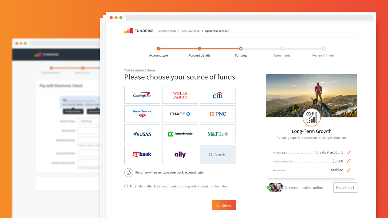
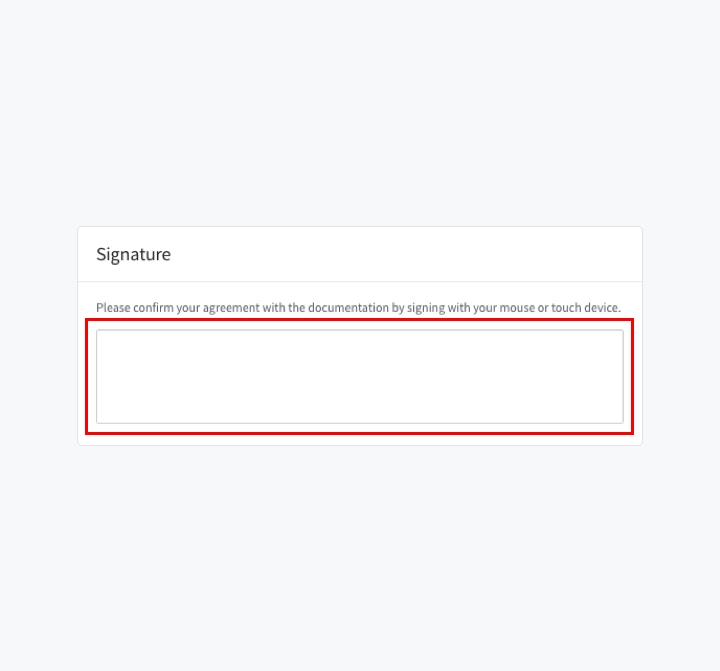
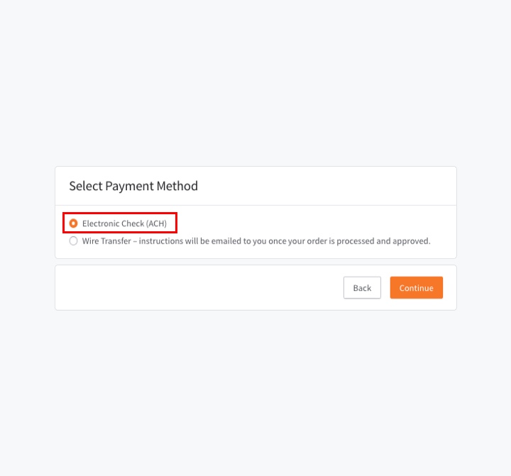
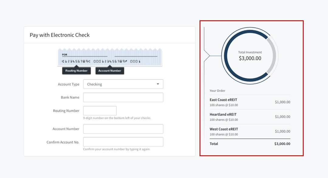
The redesigned Payment step.
Project goals
The main objective was to incorporate the new investment plans and to improve the overall conversion from user to investor. This could be broken down into several smaller tasks such as:
- Reduce the number of interactions taken from plan selection to checkout
- Address any behavioral and usability issues on pages with higher abandonment rates
- Remove legacy code
- Test new technologies to expedite user input
- Update the visual look and feel
- Document new additions to the pattern library
My role
- Metric analysis
- Ethnographic research
- Wireframing
- Prototyping & testing
- High-fidelity design
. . .
Research: Part I
Audit
The project was kicked off with a simple audit on the current checkout, paying special attention to the length of the overall flow (amount of pages) and the unique interactions on each page. This was also the time to make note of any legacy elements that needed to be removed or updated for the new product.
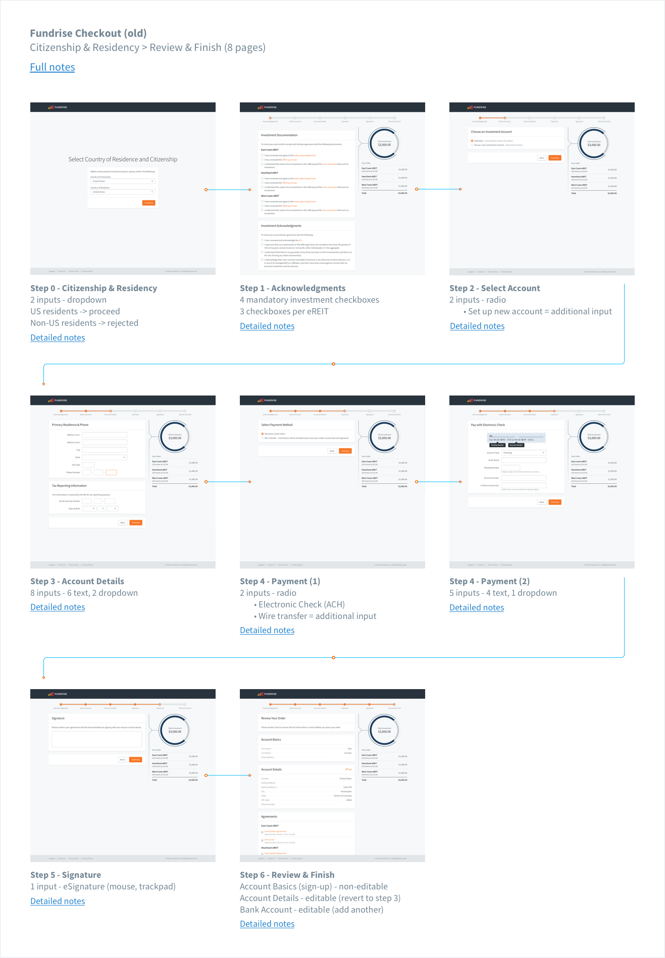
Audit doc for the old checkout flow.
Analytics
Additionally, we turned to our Google Analytics and Mixpanel segments to get a broad look at user behavior and identify any patterns of concern.
What we looked for:
- From where (what source) did they enter the checkout flow?
- How long was the average time to completion (invest)?
- How long were people spending on each page?
- Which pages had the highest abandonment rate?
- At what point did people reach out for help? Why?
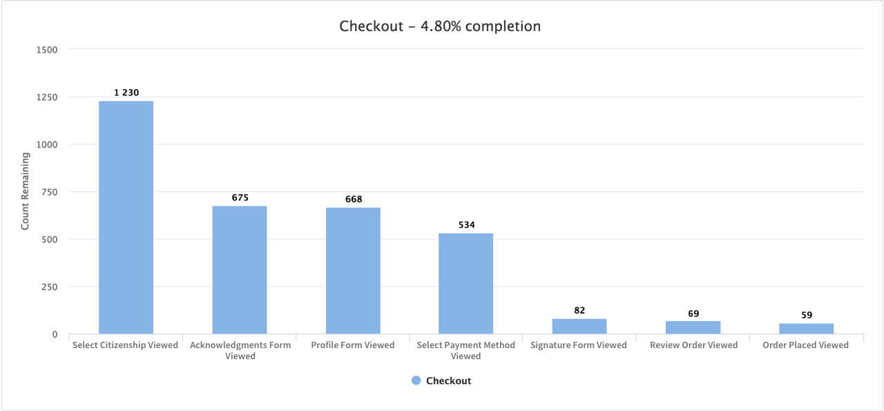
Typical conversion rate for a 24 hour period under the old checkout flow.
Key takeaways
We noticed an extremely high drop-off rate on the first and fourth step of checkout (selecting country of residence and setting up payment, respectively). Additionally, we saw fairly long view times on the Acknowledgements step and Account Details step, as well as an average completion time of about 8 minutes.
We can make a lot of different assumptions using the analytics alone, but I wanted to check for any correlation between our data and the customer support cases that came through our feedback channels. Doing this helped our team dig into the why behind the what and set the stage for a few user interviews.
User interviews
Going through our support tickets gave us a potential route into more in-depth qualitative feedback sessions. We often found that the “customers” motivated enough to enter the checkout flow and contact us with questions/feedback were more than willing to discuss their concerns in a formal follow up through email or phone. This gave us more clarity around some of the problems that couldn’t readily be answered by analytical data alone.
Analysis: Part I
Synthesizing the data
After about a week of research and interviews with potential investors, the big ticket problem areas started to reveal themselves. We distilled the research and feedback sessions into the following:
The first step wasn’t correctly setting expectations
Because Fundrise was (and currently still is) only available to US residents, non-US residents were prevented from proceeding further into checkout. Although this was stated in the Terms of Service, it wasn’t clearly communicated anywhere else on the page.
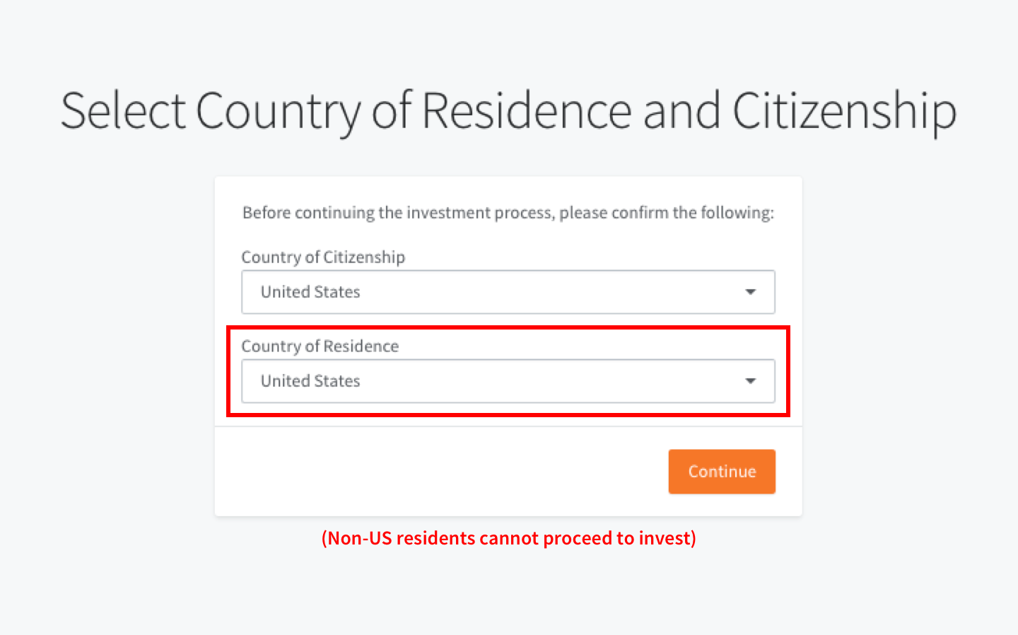
Preventing users from proceeding without first setting expectations is a poor user experience and led to a nearly 50% drop-off rate.
The process was long
Coming in at 7 pages – the checkout flow was long when compared to most other ecommerce sites (not a great comparison, but it’s what people are used to). When you add the fact that each page has an average of 6 interactions, it felt even longer.
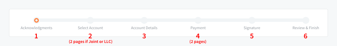
7 step progress bar can be intimidating for some.
Acknowledgements were tedious
For legal reasons, we have numerous different terms and acknowledgements the investor must agree to before investing. However, the old method of a billion separate checkboxes followed by a digital signature prompt at the end (think DocuSign) wasn’t doing us any favors.
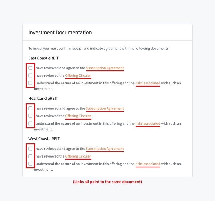
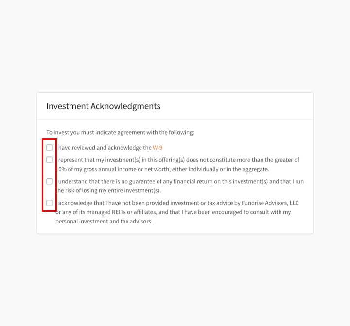
An average of 13 acknowledgements and a digital signature for an investment is a lot of cumbersome input.
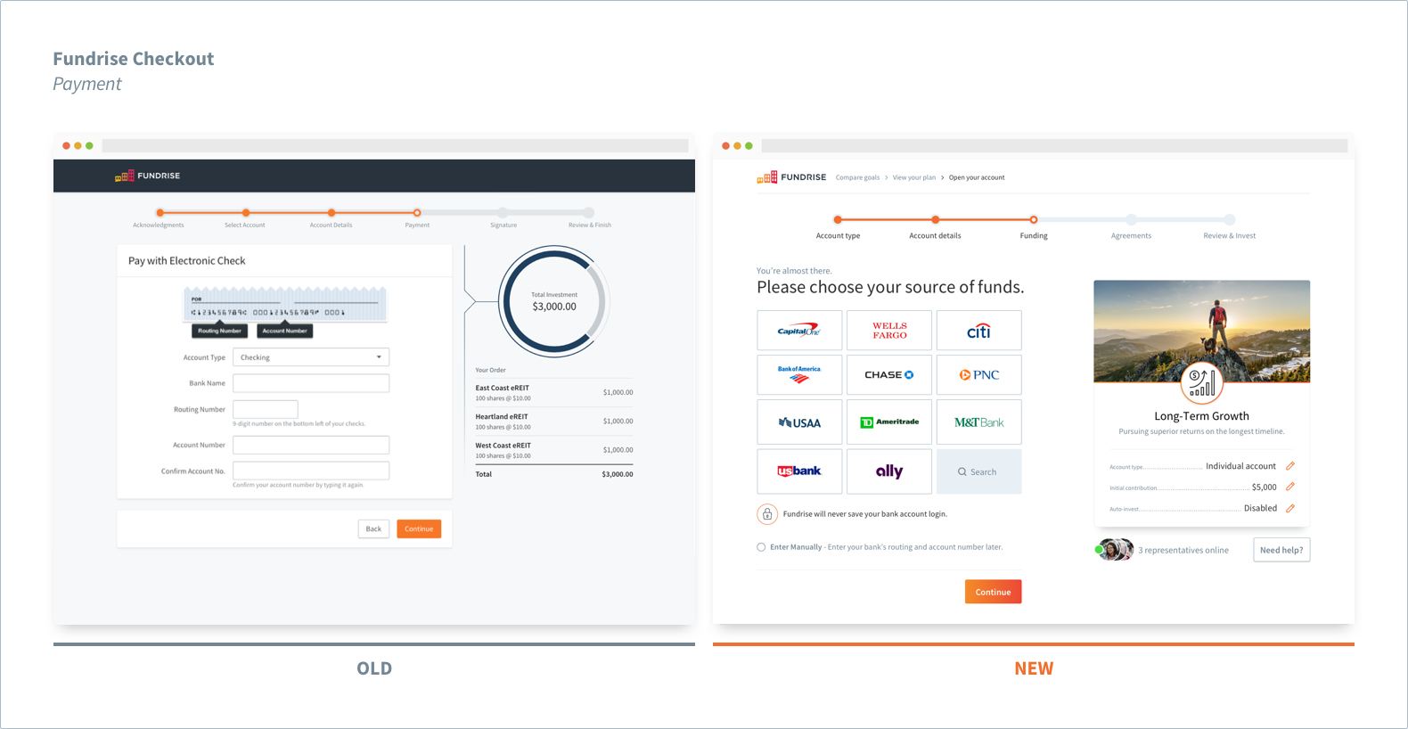
Connecting a bank wasn’t as easy as it should be
Our legacy “Payment” step required the investor to add their bank account manually via a routing and account number. We also required an unnecessary confirmation on the account number, forcing the user to input the same information twice.
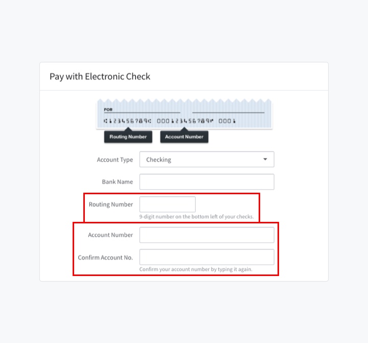
Hunting for a checkbook or having to log in to an online bank is a hassle. Manually typing and re-typing is also frustrating and unnecessary.
Editing the initial contribution was a hassle
Because the amount to invest (we call that an “initial contribution”) was chosen beforehand in an earlier screen that is NOT part of the checkout flow – there wasn’t an easy way to edit and change the values without exiting and restarting the process. Annoying for sure.
Restarting the whole process just to change the contribution led to higher abandonment rates.
Emotions ran wild
Parting with hard earned money is never easy, and investing on our platform was no different. To make matters worse, this wasn’t just some purchase that could be returned and refunded within a few days if the user wasn’t satisfied. This was a rather illiquid (5+ years) investment – with penalties on capital for early withdrawal. Didn’t exactly inspire confidence.
Research: Part II
Competitor survey
With some time to spare, I took to the internet to perform a quick analysis on a few direct and indirect competitors in the fintech space. I focused on heuristics such as:
- How easy / how much time did it take to accomplish my goal (of investing)?
- Did the checkout process keep me motivated and excited to continue?
- Was the navigation and page layout consistent and easy to understand?
- Were there feedback channels? Were they discoverable? Useful?
- What was the primary tone and voice throughout my interactions? How did I feel?
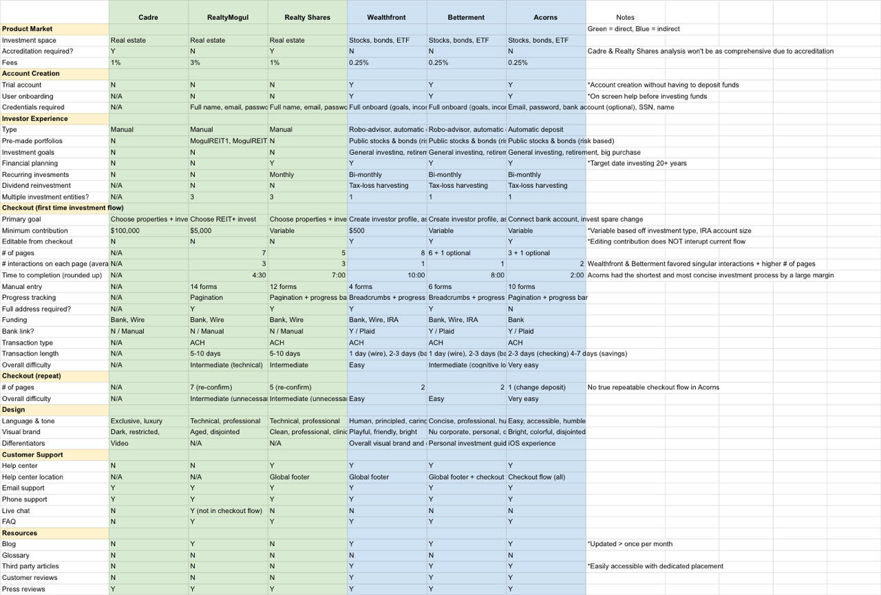
Competitor survey with direct (green) and indirect (blue) competitors.
Analysis: Part II
Identifying areas of improvement
There were a lot of things each competitor did well and… not so well. Throughout each experience, however, a few things stood out above the rest:
Security was front and center
Great care was taken to ensure the user felt comfortable and in control. Through the use of language and visual iconography, the UI’s communicated safety and security during sensitive input steps in an effort to build trust.
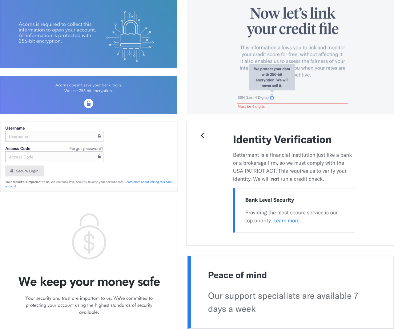
256 bit encryption and "bank level" security were plastered everywhere.
A little personality went a long way
Many modern day financial institutions are realizing that there are, in fact, humans on the other side interacting with their product or service. I was surprised to see how much personality was injected into the copywriting, one even went so far as to create a fictional “personal agent” to guide me through my investment.
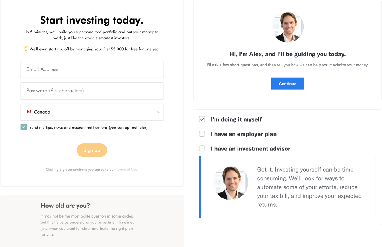
Personal copywriting and fictional agents helped guide me through the arduous process.
Forms are still a necessary evil
Too many financial services are plagued with seemingly endless pages of long form fields requiring sensitive information. Whether it’s for data collection or identity verification, we have grown accustomed to signing away our lives in pursuit of financial well-being. It’s just the way it works when dealing with money and no one has appeared to make any significant stride in solving it.
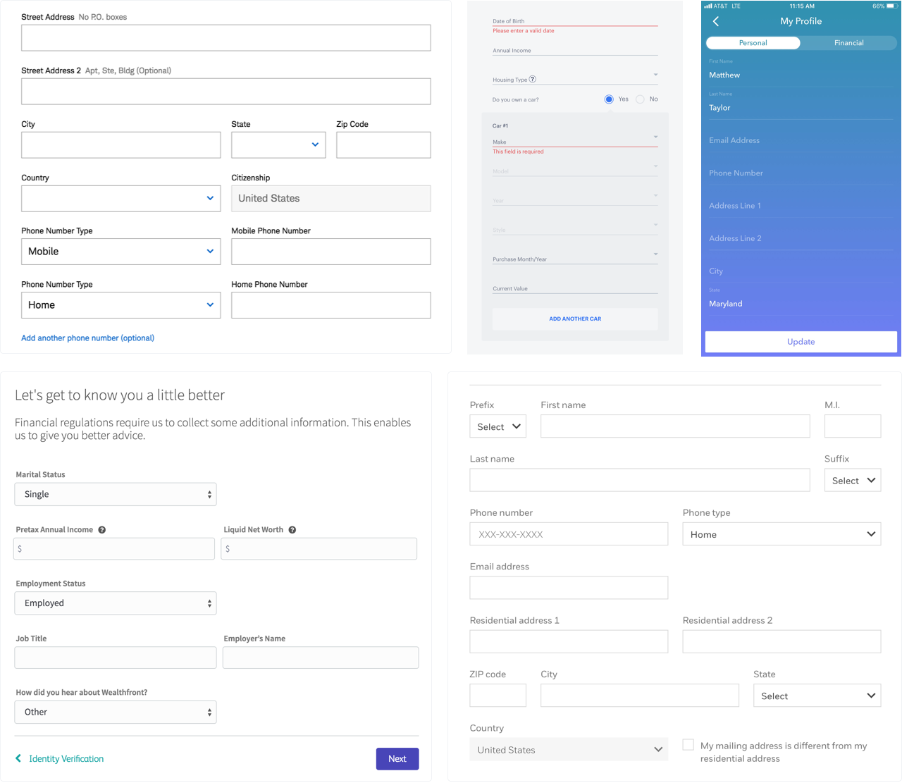
Various form fields for signing up and investing.
Updating the user flow
We concluded our research phase with an updated user flow to serve as base for future wireframing and prototyping. The main goal here was to reduce the number of pages and interactions on each page. This flow was expected to evolve over time as we received feedback on the prototype.
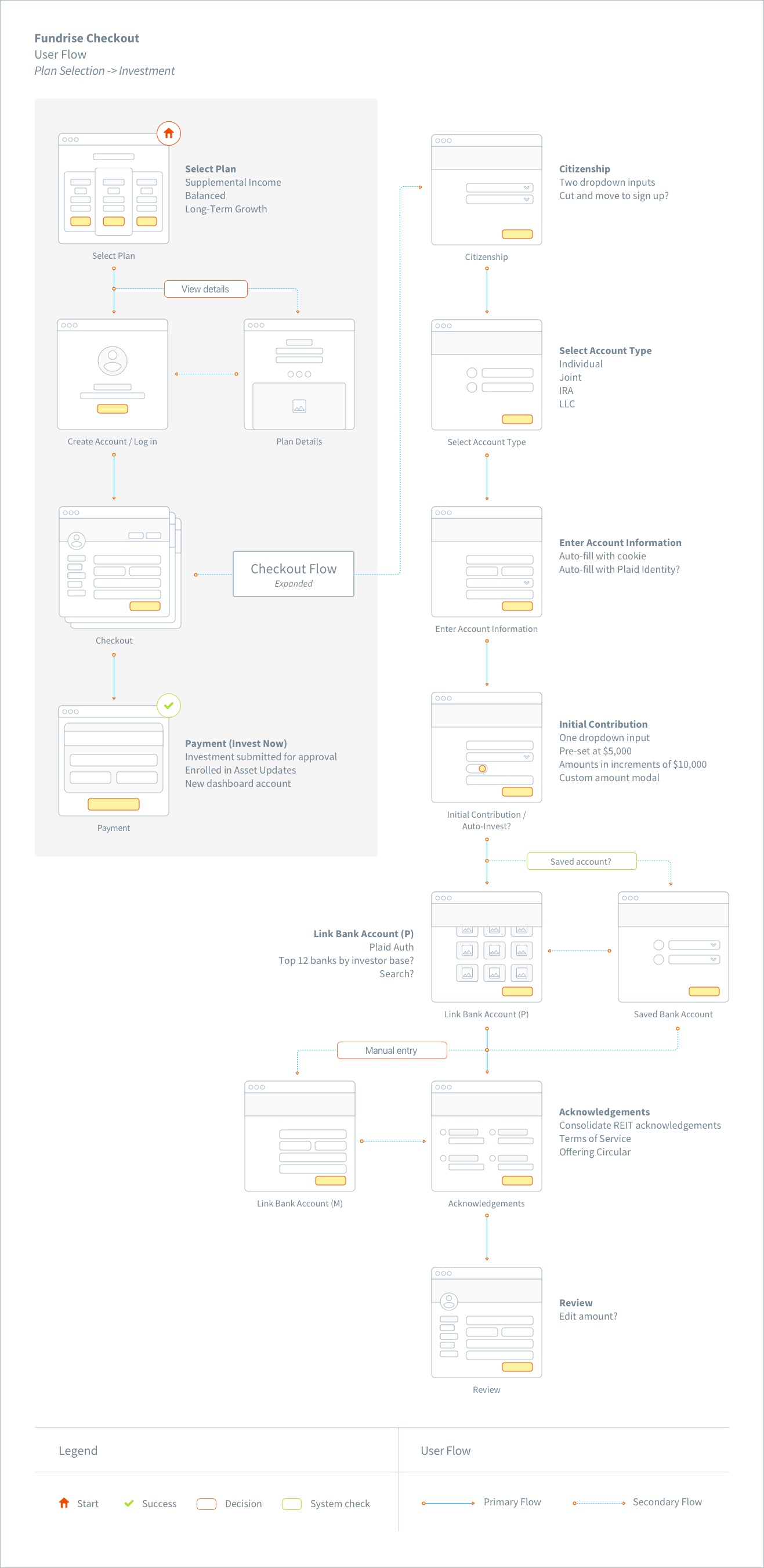
Final iteration of the new user flow.
Designing the experience
Creating the MVP
With our preliminary research and project goals at hand, the team established a general direction for an MVP. We presented our findings to key stakeholders and put together a list of proposed updates for buy-in. We discussed everything — from removing the need for personal contact information, to utilizing third party API services such as Plaid to consolidate payment.
By the end, the MVP looked something like this:
- 5 - 6 screens max
- Automatic bank account connection via Plaid (manual option as back-up)
- Live chat (not required, but something we wanted to explore)
- Auto fill input with cookies and/or Plaid
- Editable investment amount from inside the flow
- Updated voice, tone, and visual identity
Planning
With the green light from engineering and product on an MVP direction, I established a timeline and sprint schedule before iterating on any further deliverables. The goal was to have a validated prototype ready for testing by the end of week two. This timeline was a little tight (considering we had more research to do surrounding a few API services), but doable.
Whiteboarding
At this point I had a lot of different ideas on potential features and needed to get a few down on paper to clear my head. I organized a quick design studio with a few other designers and together, we sketched out different layouts and feature ideas that addressed the research and analysis. After a quick round of feedback we were able to narrow it down to a few different versions that would serve as a base for low-fi wireframes.
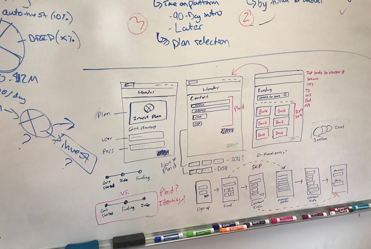
One of many whiteboarding catastrophes.
Sketching
I sketched down a few of the main takeaways from the design studio on paper to use as a reference. Because our whiteboarding session was fairly robust, I didn’t want to spend too much time regurgitating the details that were already covered. Once I felt I had what I needed, I moved into digital.
Wireframing
Armed with a validated user flow and a lot of doodles, I started on a round of digital wireframes. This is where I started to map out the core MVP features in depth – exploring things like Plaid and automatically connecting a bank account, where and how to choose an initial contribution, and the placement of a live chat instance. I gathered feedback on a rolling basis and was able to iterate through different versions relatively quickly.
Final wireframe iterations.
Prototyping
Opting for speed and simplicity, the initial prototypes were built from the wireframes using Sketch and InVision. InVision was the perfect tool for the job here as it allowed us to pass the prototype around the office and to friends and family for quick, asynchronous feedback. We were mainly validating the condensed flow (when compared to the old version) and testing for any glaring usability issues.
High fidelity design
This prototyping cycle went through a couple rounds of iterations before leading up to the final sprint, where we jumped into high fidelity. At this point, most of the high level usability concerns had been addressed, and the engineering groundwork had been laid out in preparation for the overhaul. I made sure to utilize as many components from our already-built pattern library as much as I could, as well as documenting all potential new additions to be discussed and approved out of band.
Final hifi mocks.
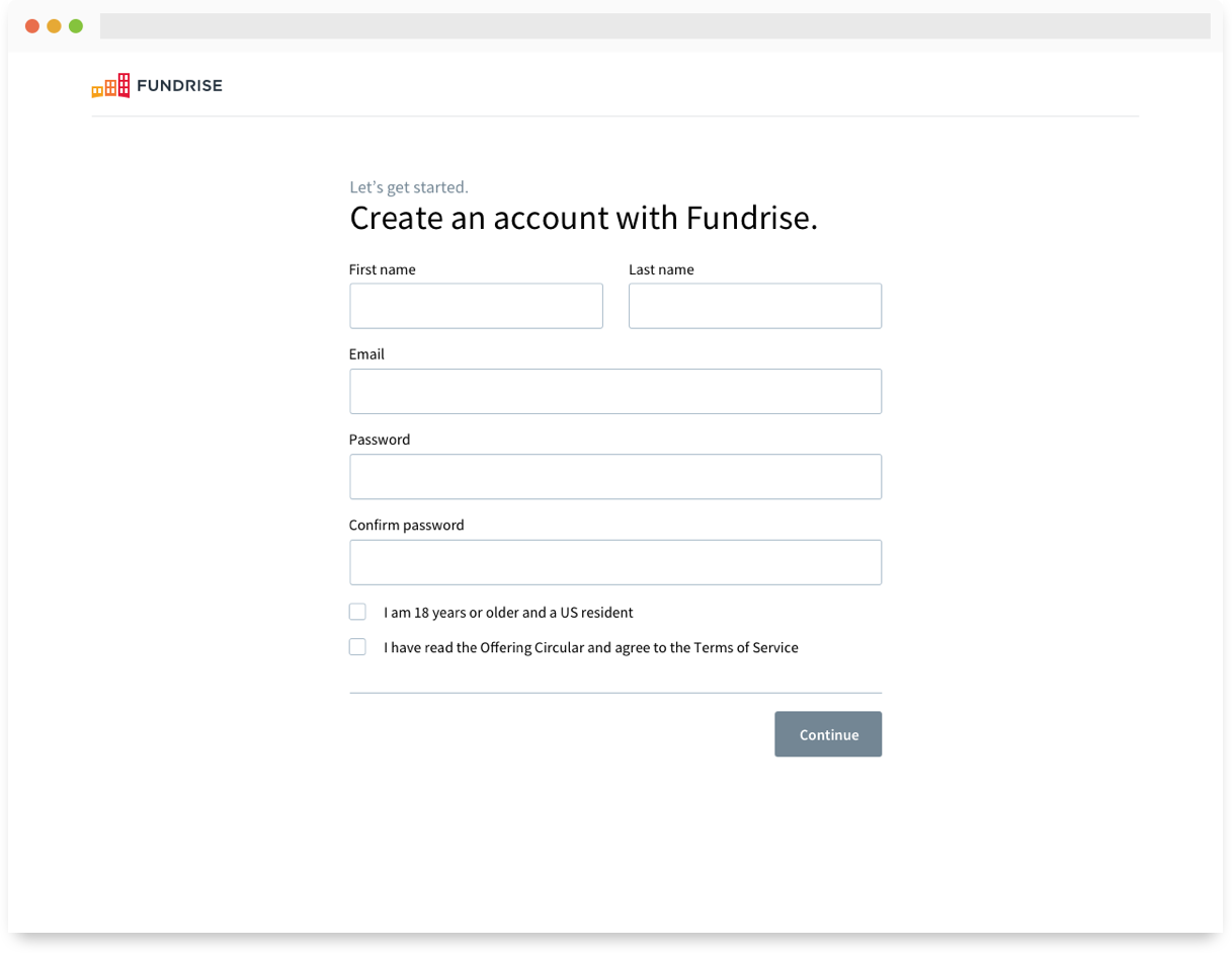
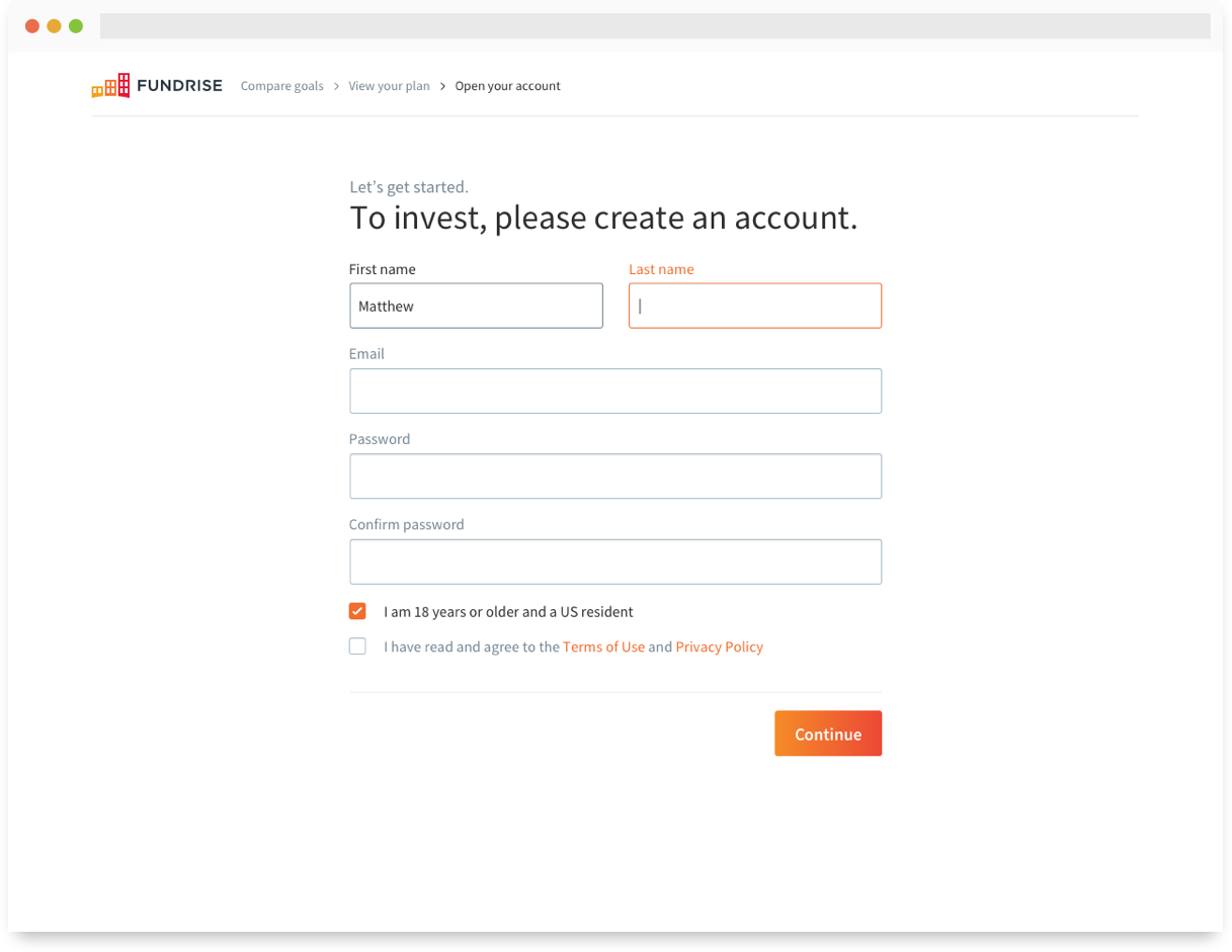
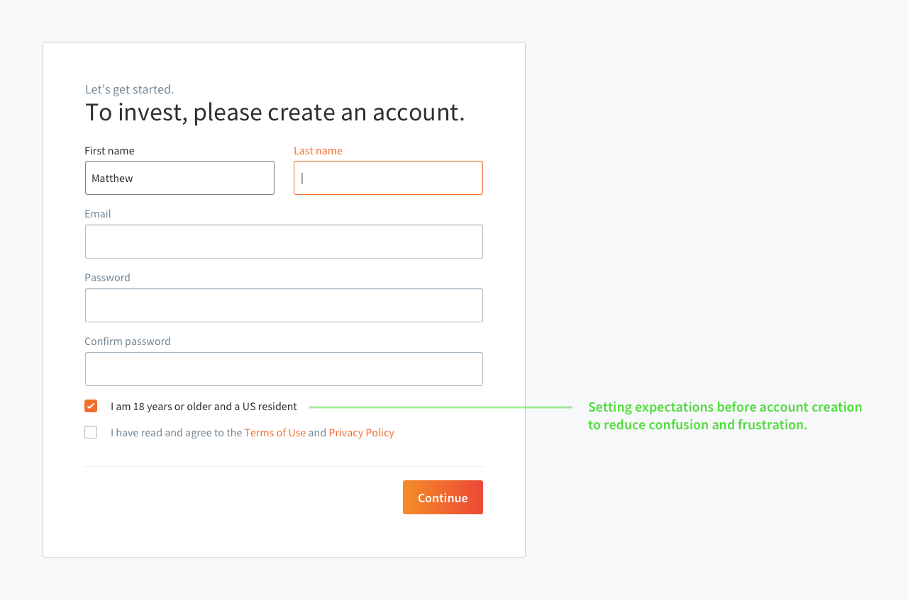
Sign up
One of the simplest and most effective updates we made to the flow was moving the country of residence selector to an acknowledgment during sign up. This was a much more proactive approach at communicating our terms and setting the correct expectations before allowing the user to continue. Although we saw a reduction in total sign ups, the conversion rate improved dramatically.
Sign up module.
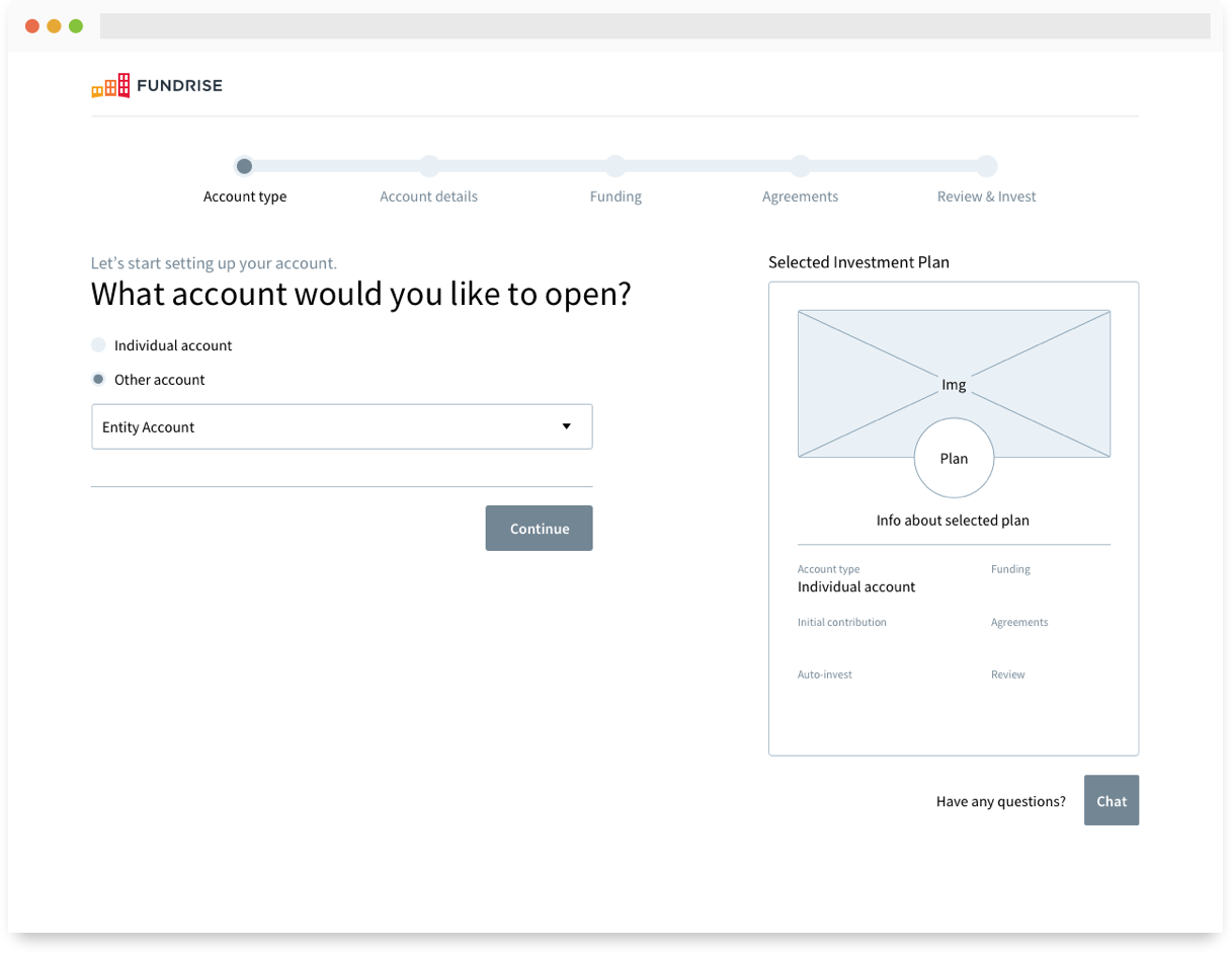
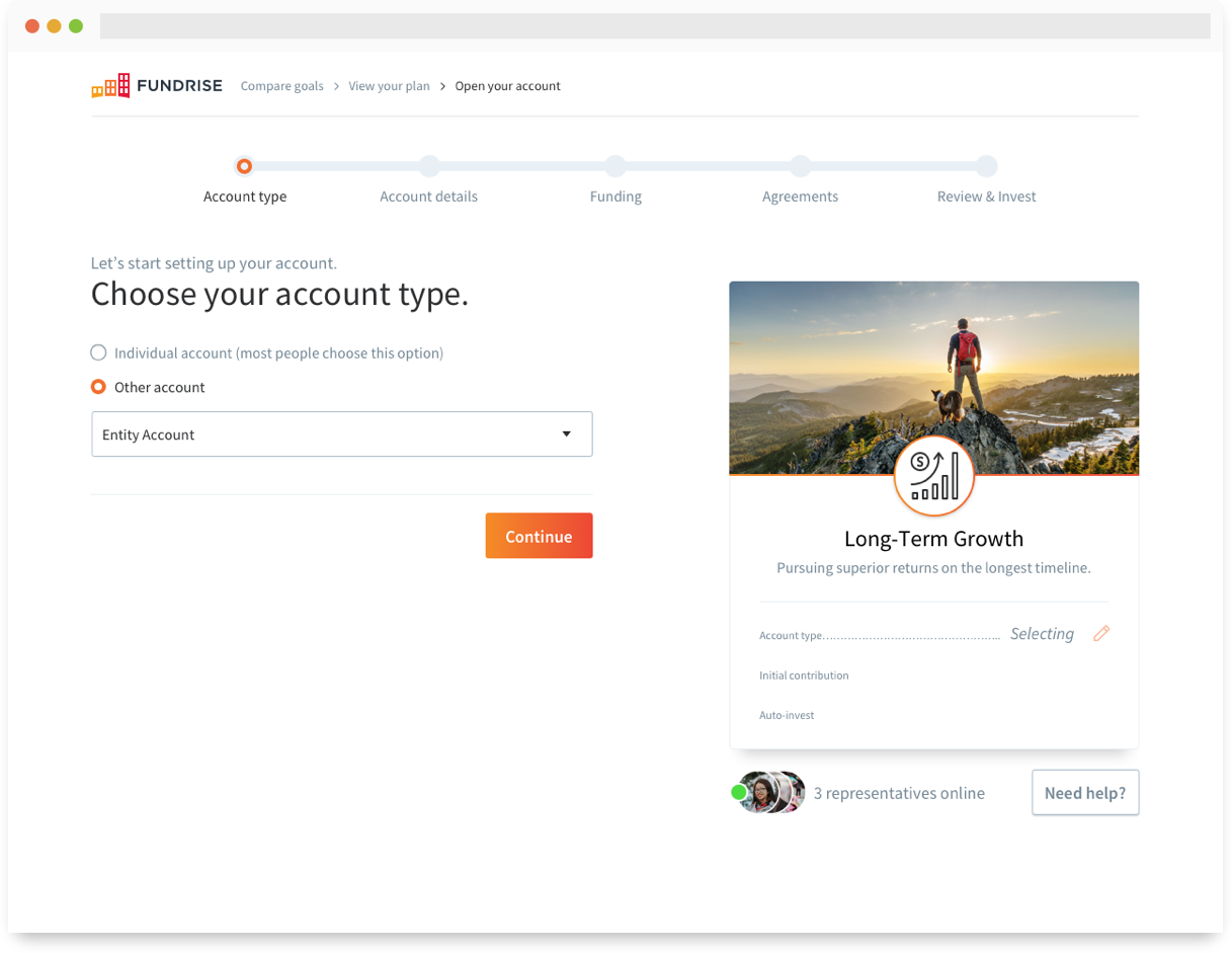
Investment card
We developed the concept of an investment card during a bigger redesign effort after introducing the goal-based investment plans. The card itself is a visual wrapper that represents the users selected investment plan. Each plan contains a unique mix of real estate investments tailored to specific investment goals (retirement, big purchase, monthly income, etc).
The soon-to-be investor encounters these cards earlier in the funnel when choosing a plan. We wanted to persist a similar card into the checkout flow to maintain visual continuity and act as an anchor for the more important pieces of checkout, such as editing their initial contribution.
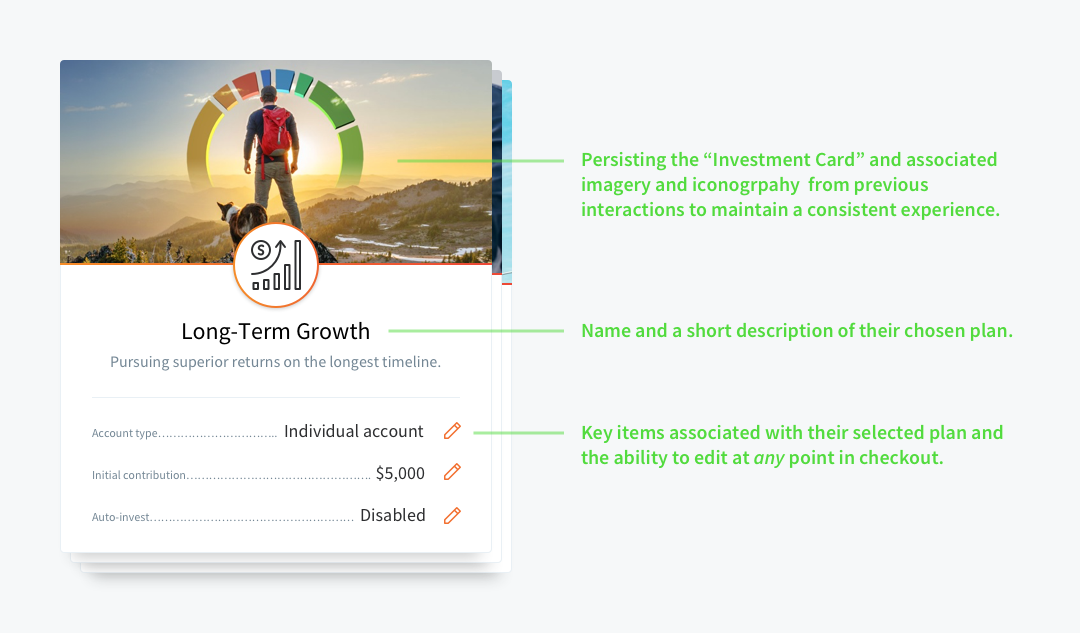
Investment card for the Long-Term Growth plan.
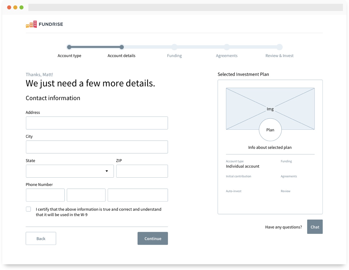
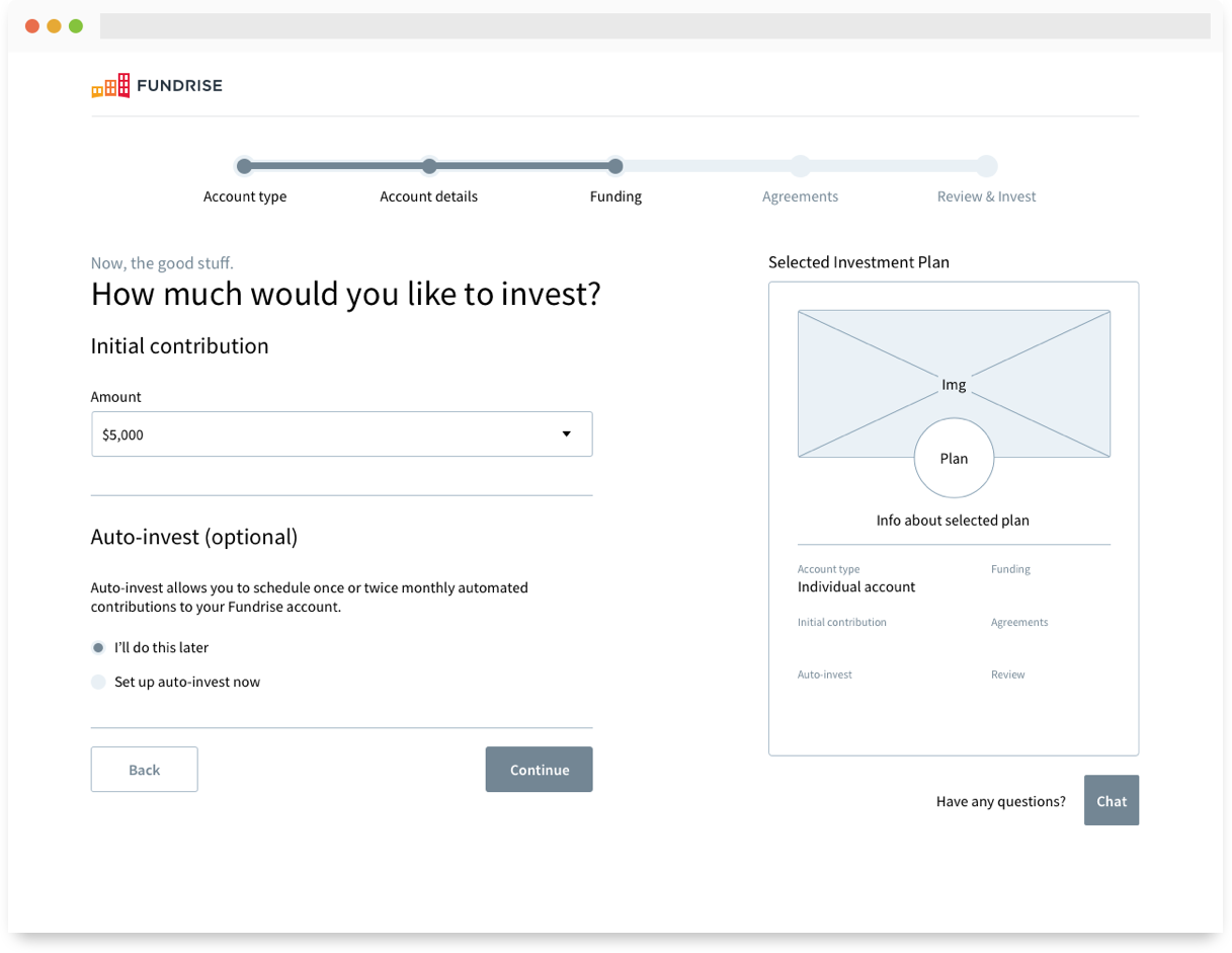
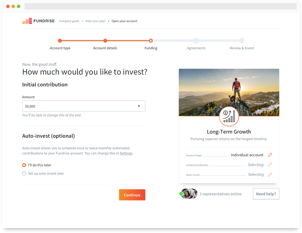
Initial contribution
Speaking of initial contribution, this step was missing entirely from the legacy flow. The old model required the investor to choose an investment amount in a separate, non-transactional experience before proceeding into the transactional checkout. This threw everyones expectations out of whack and proved to be cumbersome when editing an amount.
We took that interaction and moved it inside the checkout flow, where it was more contextually and thematically appropriate. This solution also meant that the investor didn’t have to restart the entire checkout process when editing the dollar amount. Additionally, I saw an opportunity to introduce our optional auto-invest feature (monthly recurring investments) which, when enabled, would mean the investor never has to go through this flow again!
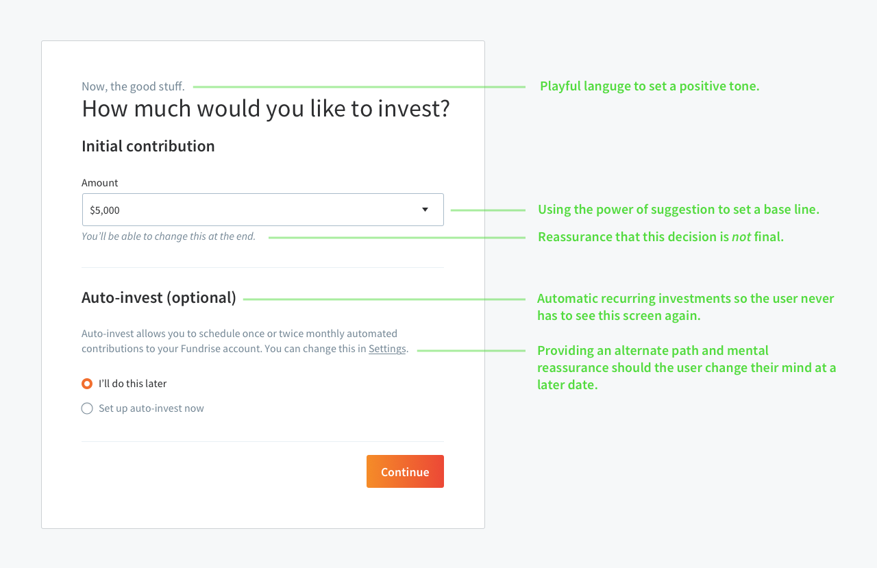
Initial contribution + auto-invest module.
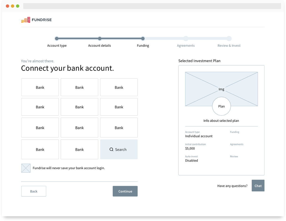
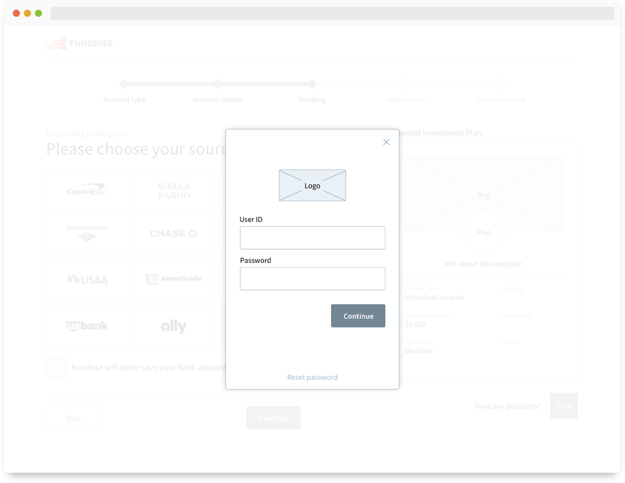
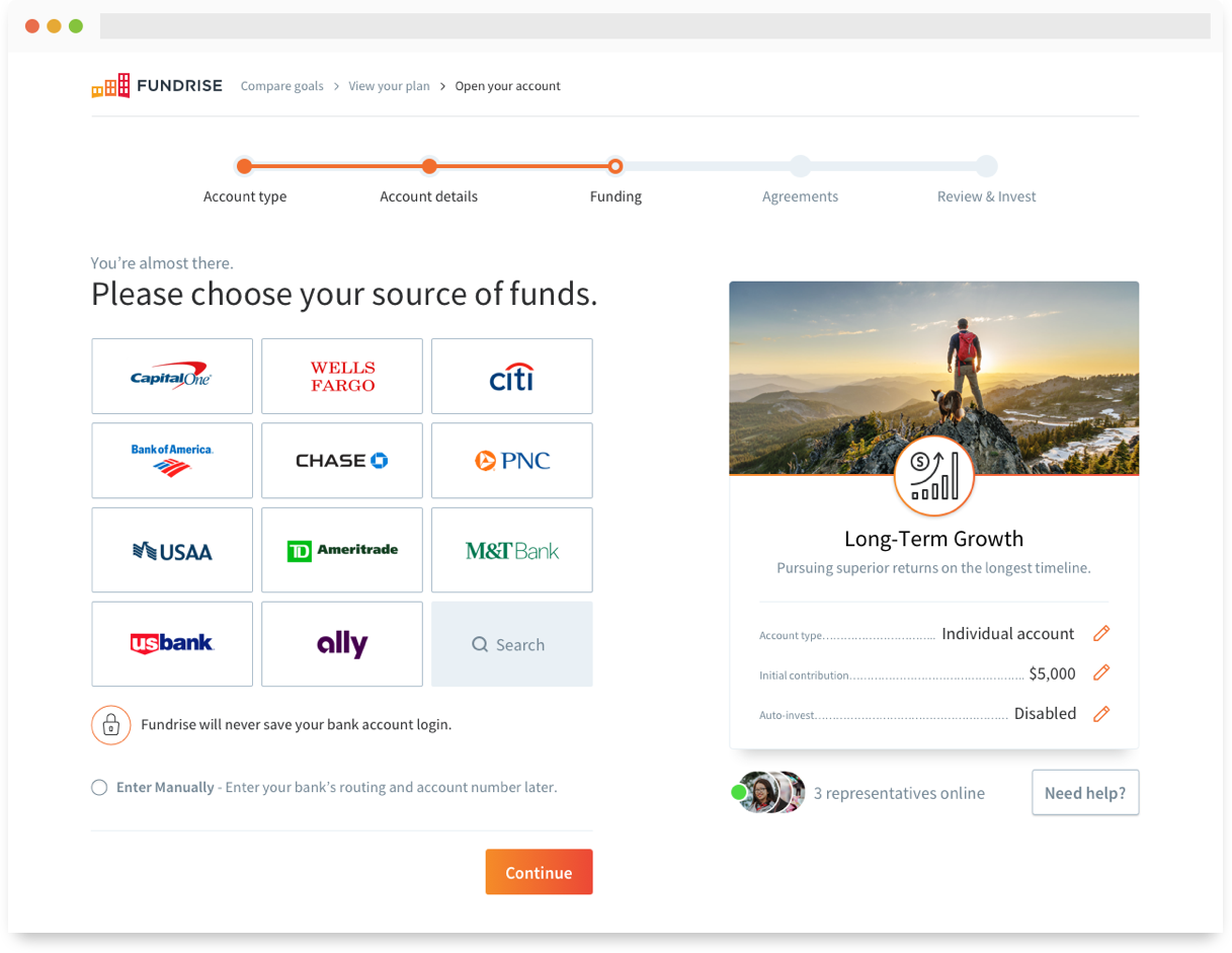
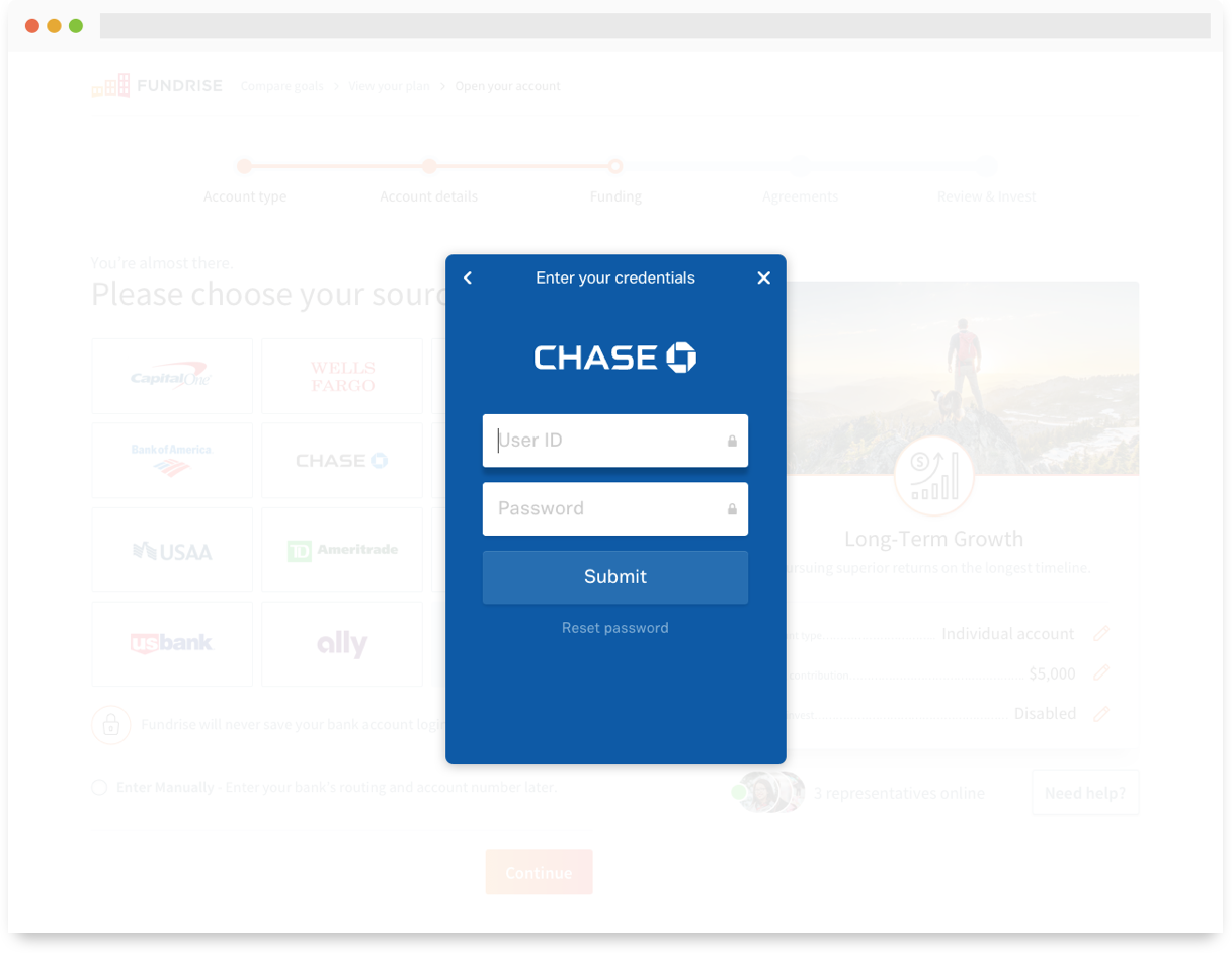
Plaid
The old ACH/electronic check setup was replaced with Plaid, a third party service that allows the investor to connect a bank account using their online credentials. We opted for a 3x4 grid with our top 11 most frequently connected banking institutions.
Not only was this visually credentializing, but greatly reduced the effort invoved when connecting a bank account. Gone are the days of searching the house for a check (or googling your bank) and typing in the routing numbers.
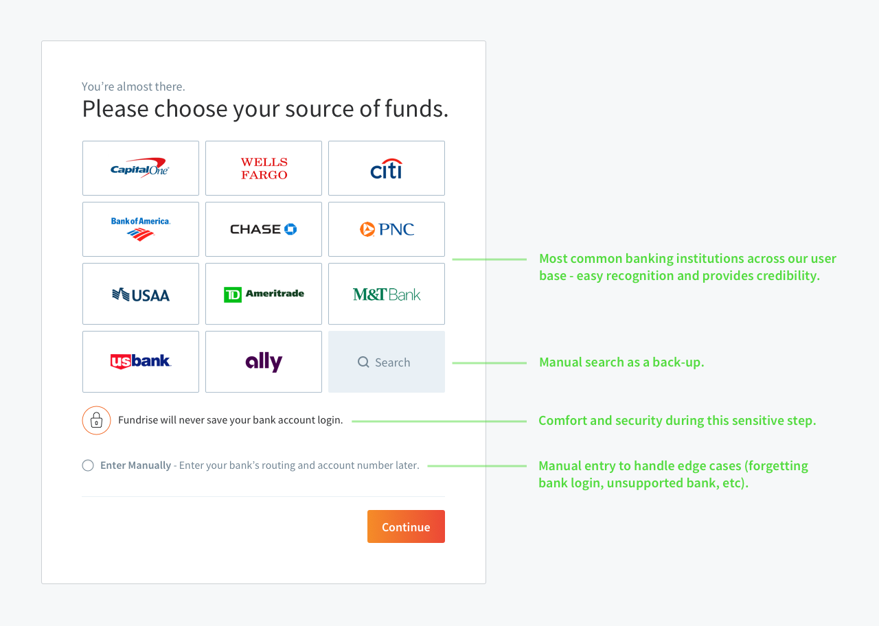
Bank account connection via Plaid.
Live chat
This was a feature that sat in the backlog for awhile, waiting for a good implementation strategy to come along. We wanted to provide a more obvious and open feedback channel, as well as immediate assistance in an effort to increase conversion. We didn’t love the idea of talking to an anonymous customer service rep behind a wall of text, so we prioritized the ability to show not only how many representatives were online, but who specifically from our team was available to help.
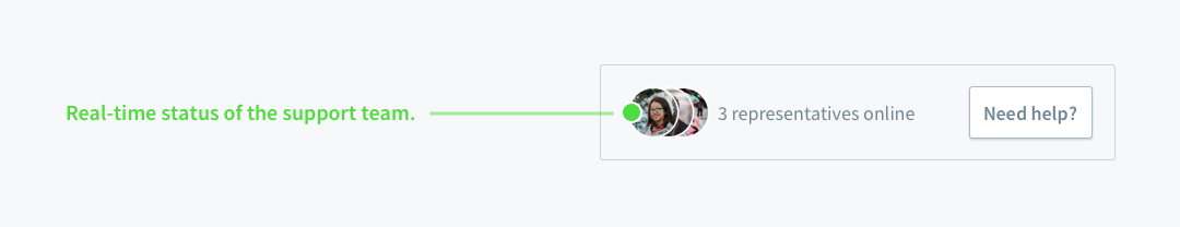
Live chat via Olark.
Screen first
About 80% of our investor conversion happens on a desktop device, so designing for larger screens was the priority during this initiative. However, we were able to create a clean experience on all screen sizes
by utilizing our component-based library, being cognizant of our breakpoints, and keeping the flow contained to two columns.
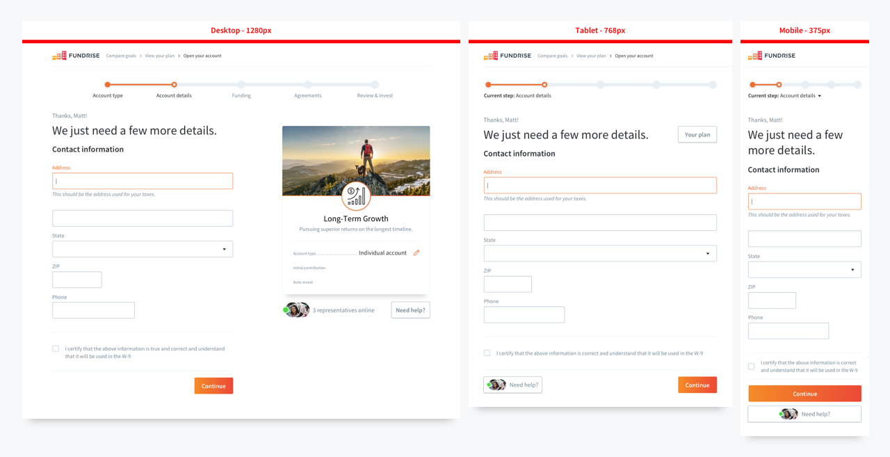
Reference doc illustrating a few device breakpoints.
Development
Once the team felt comfortable with the direction, I drafted up some (minimal) specs and worked with the front-end team on implementation. I only had to document a few new additions, as most of the flow used pre-existing components.
Testing
During development, we set up a staging server to use for a few rounds of user testing. We ran a few unmoderated tests with UserTesting for general feedback on usability, as well as a round of in-person testing for more qualitative feedback. The in-person testing was insightful, but it was difficult to simulate a realistic environment and test against a real world scenario.
Having to use fake information for the more sensitive inputs (social security, date of birth, bank account login, etc) in combination with a fairly linear path made it harder for our users to suspend their disbelief. To get around this, we decided to alpha test with real investors, utilizing a small series of gradual releases to our live environment.
Conclusion
Results
We’re still testing against all our success metrics, but we’re starting to see a massive increase in conversion (20 - 25%) from user to investor. Take this snapshot with a grain of salt — the impressive increase is a result of many different initiatives coming together, not just the checkout redesign. Yet, despite that fact, we are seeing dramatically reduced page view times in between steps, and an increase in conversion centered around payment.
The visual look and feel has been updated to reflect the newer branding efforts, and the qualitative feedback is being documented on a rolling basis as we continue to test and refine.
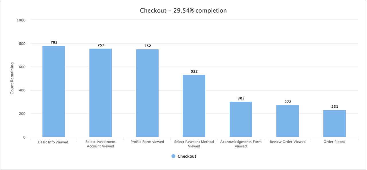
Updated conversion rate for a 24 hour period as of January 2018.
Next steps
Next on the list is altering the step order, namely placing the Funding step first. With the users consent, doing this will allow us to take further advantage of Plaid and use data stored in their bank account to auto-fill contact information and other input fields during later steps. The ultimate goal is to reduce friction and make this entire process as painless as possible.
An even better solution is to remove the need for sensitive contact information altogether. Requiring phone numbers and residential addresses are all compliance regulations that I would like to see made optional, across all fintech services.
Retrospective
Overall, the team is happy with the preliminary results — but we have much to do still. After a bit more testing and validation, we’re going to broaden the rollout to ensure stability before we go and mess things up again.
Prototyping early and often saved the day throughout this initiative. Being able to quickly iterate through high level ideas and test around the office saved a ton of time. When it came time for high fidelity mockups and real user testing, we had already knocked out a ton of usability issues.
Feature creep reared its ugly head at many points during the redesign and really put a strain on the developers. Almost the entire codebase needed to be rewritten to accommodate the new investment plans — but throwing multiple third party API services into the mix required a lot more time and effort than anticipated.

Thanks for reading!
Matt Taylor
PS: If you're not a fan of the experience on my blog, head over to Medium and throw me a follow to stay up to date with all of my shenanigans.